
Type: Brand Identity / Logo Design
Role: Logo Designer
Duration: 3 Weeks
Tools: Adobe Photoshop, Adobe Illustrator
Role: Logo Designer
Duration: 3 Weeks
Tools: Adobe Photoshop, Adobe Illustrator
INTRO — The ASK
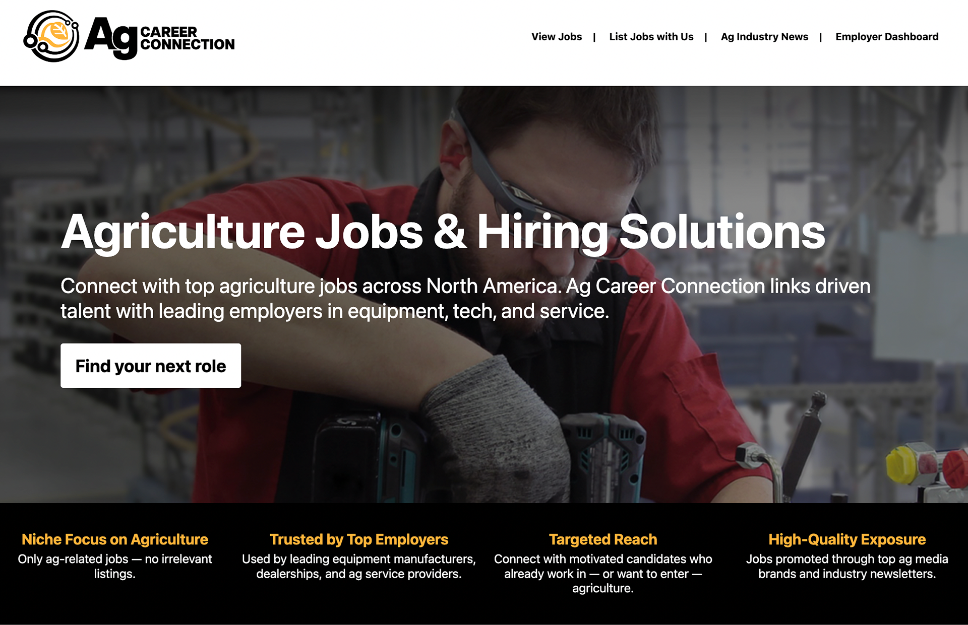
Ag Career Connection is an online platform developed by Lessiter Media designed to connect employers in the agricultural industry with fresh talent across North America, linking driven candidates with leading companies in equipment, tech, and service. It was built to sit alongside Lessiter's already established roster of B2B publications — No-Till Farmer, Strip-Till Farmer, Farm Equipment, and others — as a new product expanding the company's reach beyond print and into active industry recruitment.
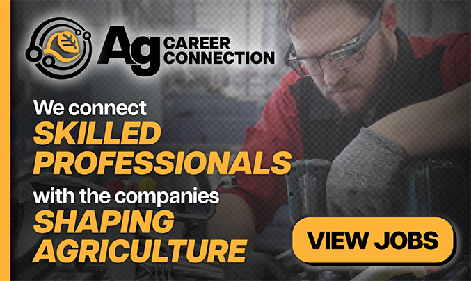
During my internship at Lessiter Media as a graphic design intern, a marketing intern named Monika approached me about contributing to the project. She had been tasked with building out the platform largely on her own, and she needed a logo and logomark to anchor the brand's visual identity. It was a side project at that point — not a lot of hands on it yet — which meant there was a real opportunity to lay the foundation for something from the ground up rather than slotting into a pre-existing system. That kind of open brief doesn't come around often, especially early in your career, and I wasn't about to pass it up. Pictured below is is one of the many web banners I also created to advertise the online platform:
CONTENT — Deliverables
Starting From the Brief
Before a single mark was made, Monika put together a brand document outlining the core values of Ag Career Connection and what it needed to communicate visually. One of the central concerns she flagged was audience alignment — the platform is built specifically for people in agricultural industries, and that audience tends to skew traditional. A logo that leaned too hard into tech-startup minimalism or used color palettes that felt more Silicon Valley than farmland was going to alienate the exact people the platform was trying to reach. That tension between feeling modern and feeling grounded shaped every direction I explored from the start.
Early Exploration
My initial round of mockups was done in Photoshop — loose enough to move fast, detailed enough to communicate distinct directions. Rather than iterating on a single concept, I pushed three completely different looks simultaneously to get a read on what was and wasn't working early.
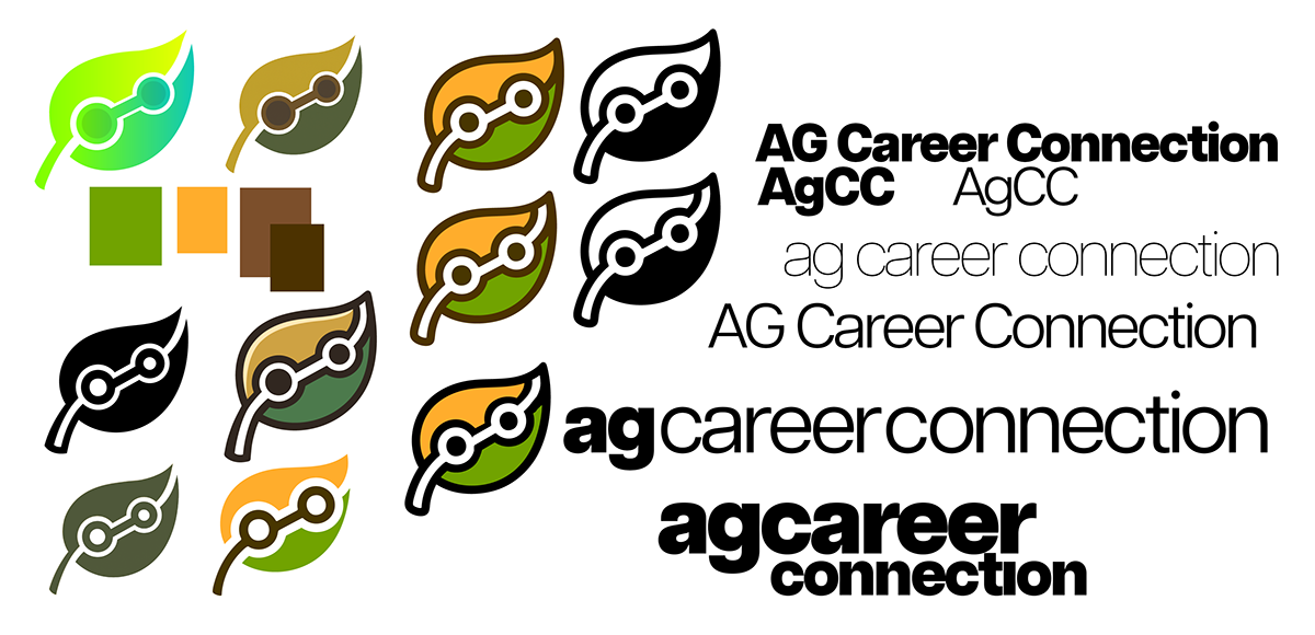
The first direction leaned into green and blue gradients with a leaf-based logomark, building on the idea of the platform as a one-on-one connector between employers and candidates — a visual handshake of sorts. A variation of this same concept reframed the leaf to look like it was wearing a pair of glasses, positioning the brand as a knowledgeable guide or partner for anyone trying to break into the agriculture industry for the first time.
The second direction went for something that felt more like print — bold black and white outlines, a font choice that recalled job listings in a trade publication or industry brochure, and a high-contrast green that gave it visual weight without feeling digital. Given that Lessiter's entire background is in B2B print media, this one felt like a natural fit for the ecosystem the brand was being born into.
The third was a deliberate swing in the opposite direction — clean vector lines, a neon green and black palette, and a minimalist structure that leaned into the tech side of the platform's identity. It was an experiment more than a serious contender, but it was worth putting on the table to understand exactly how far in that direction was too far.
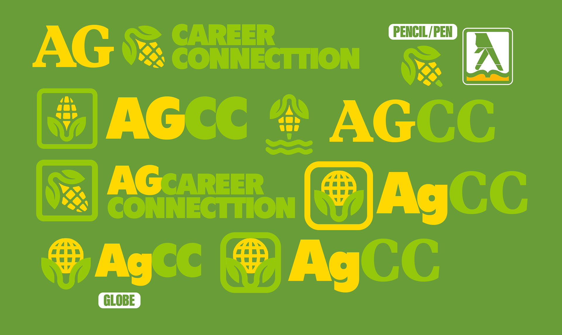
A fourth direction came at Monika's request — exploring the use of a corn motif as the primary logomark, rendered in soft yellows and greens with variations that transformed it into a pen, a globe, and other symbols of industry and communication. It was a genuinely interesting constraint to work within, but the direction was scrapped fairly quickly. It read as too literal and too narrow for a brand that needed to feel expansive and professional rather than purely agricultural.
Finalizing the Direction
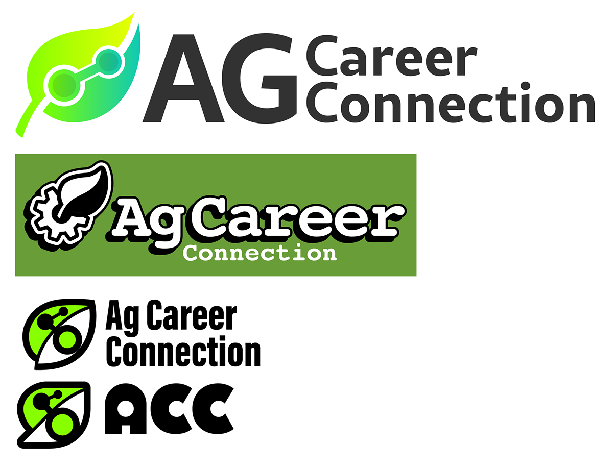
The concept that ultimately won out was the one that had been quietly the strongest from the beginning — a network of circular nodes surrounding a plant, suggesting growth, connection, and opportunity all at once. The plant reads as a new leaf in someone's career path; the nodes around it evoke the connectivity and reach of the platform itself. It's a logo that communicates what the brand does and what it wants its users to feel, without spelling either of those things out.
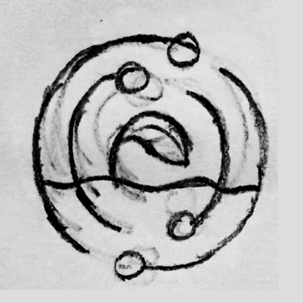
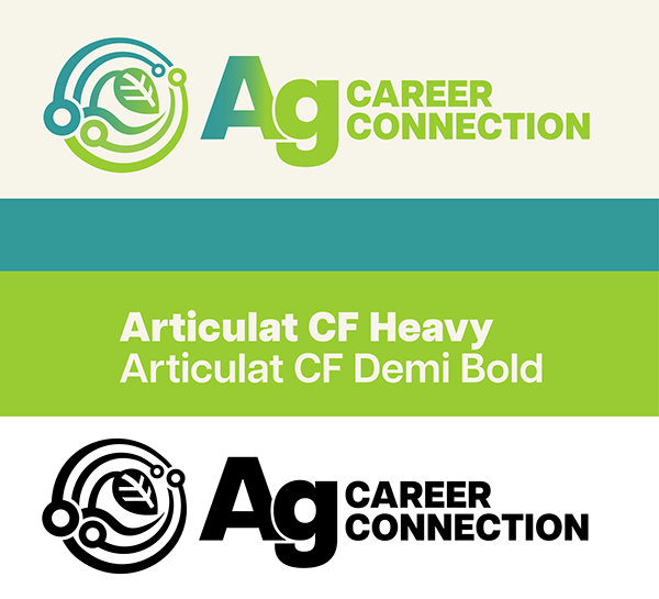
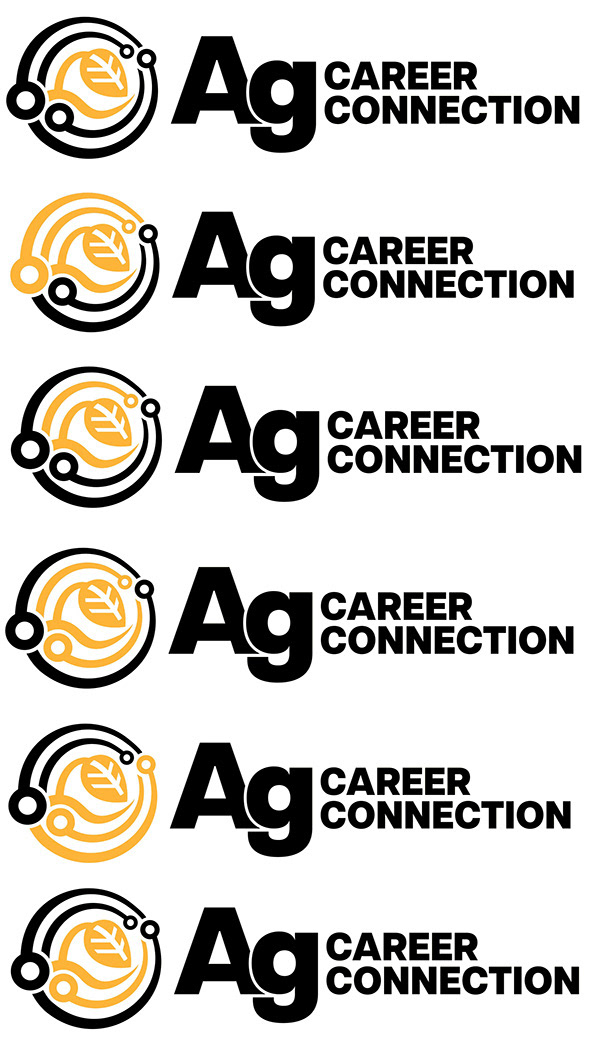
The finalization process involved a round of hand sketching — working out the proportions of the mark on paper before committing to vectors in Illustrator — followed by a series of color variation tests. Which elements should be gold, which should be black, how much contrast was needed between the mark and the wordmark, whether to revisit the earlier green and blue gradients in a more refined form. I kept Monika updated throughout, sending over revisions in real time and responding to feedback quickly as she was actively building the website in parallel. Watching assets I sent over appear on a live brand's website almost immediately was one of those moments that makes the work feel tangible in a way that classroom projects rarely do.
CLOSURE — Reflection
Ag Career Connection is still being developed, and I genuinely don't know what the final version of the identity will look like by the time the platform fully launches. That's the nature of being early on something. But laying the visual foundation for a brand that didn't exist yet — inside a real internship, working alongside real stakeholders, with assets that went live on an actual website — is exactly the kind of experience that separates the classroom from the industry. I came into Lessiter already comfortable with the tools. I left with a better understanding of how to use them in service of something bigger than the work itself.