
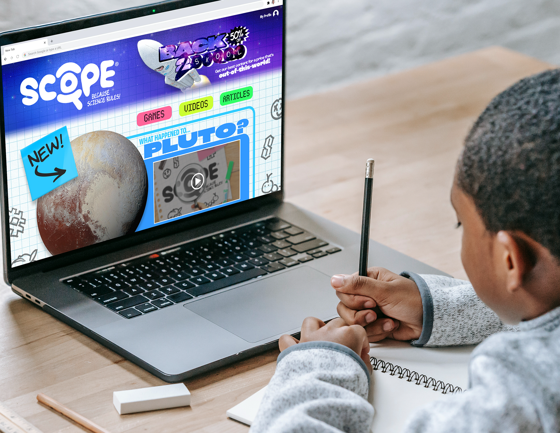
SCOPE is an online platform featuring hundreds of pages of up-to-date news, articles, videos, weekly shows, quizzes, games and more tailored for kids by passionate educators from around the world. It's not only a place where your kids can roam free and satisfy their curiosities through a wealth of engaging content, but also an educational tool for parents and teachers for use both at home and in the classroom.
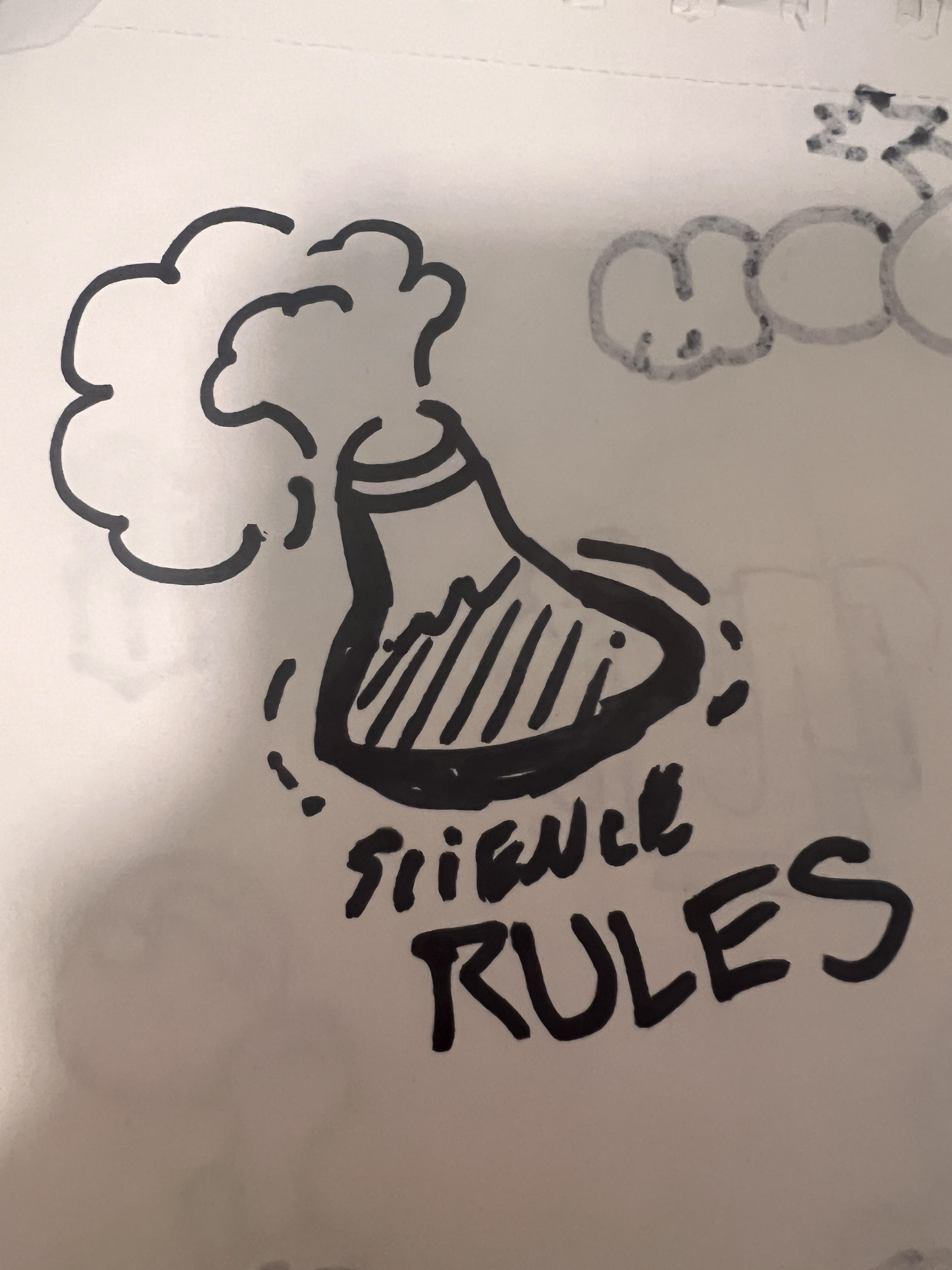
SCOPE's tagline, "Because science rules," is baked into the essence of the brand's personality. We love science and technology as much as the user, and so we're always providing content in a fun and flashy manner, with illustrations and videos that make use of bold & vibrant shapes and colors, and writing that isn't afraid to have a bit of humor! If kids want to think science is cool, then we have to do our best to prove it is.
When designing content for SCOPE, it's important to understand that there are relevant topics in science that aren't as positive or appropriate, especially in an age of increasing climate change issues.
Our core values revolve around catering to an experience that can be enjoyed by not only our youth, but anyone regardless of their age. If you want something more mature, there are plenty of other sites for that.
Type: Brand Identity / Visual Standards
Role: Solo Designer
Duration: 2–3 Weeks
Tools: Adobe Illustrator, Photoshop, InDesign, Final Cut Pro
Role: Solo Designer
Duration: 2–3 Weeks
Tools: Adobe Illustrator, Photoshop, InDesign, Final Cut Pro
INTRO — The Ask
This started as a logo assignment for my graphic design class at the University of Miami, but I took it and turned it into something much bigger. The brief was simple: design a logo for a brand that you want to see be made. After much brainstorming, I got genuinely excited about what SCOPE could be as an actual online science platform for kids/teens that doesn't treat them like they’re stupid. By the end, I had a full brand identity: logo, color system, typography, secondary illustrations, motion graphics, and a complete visual standards document.
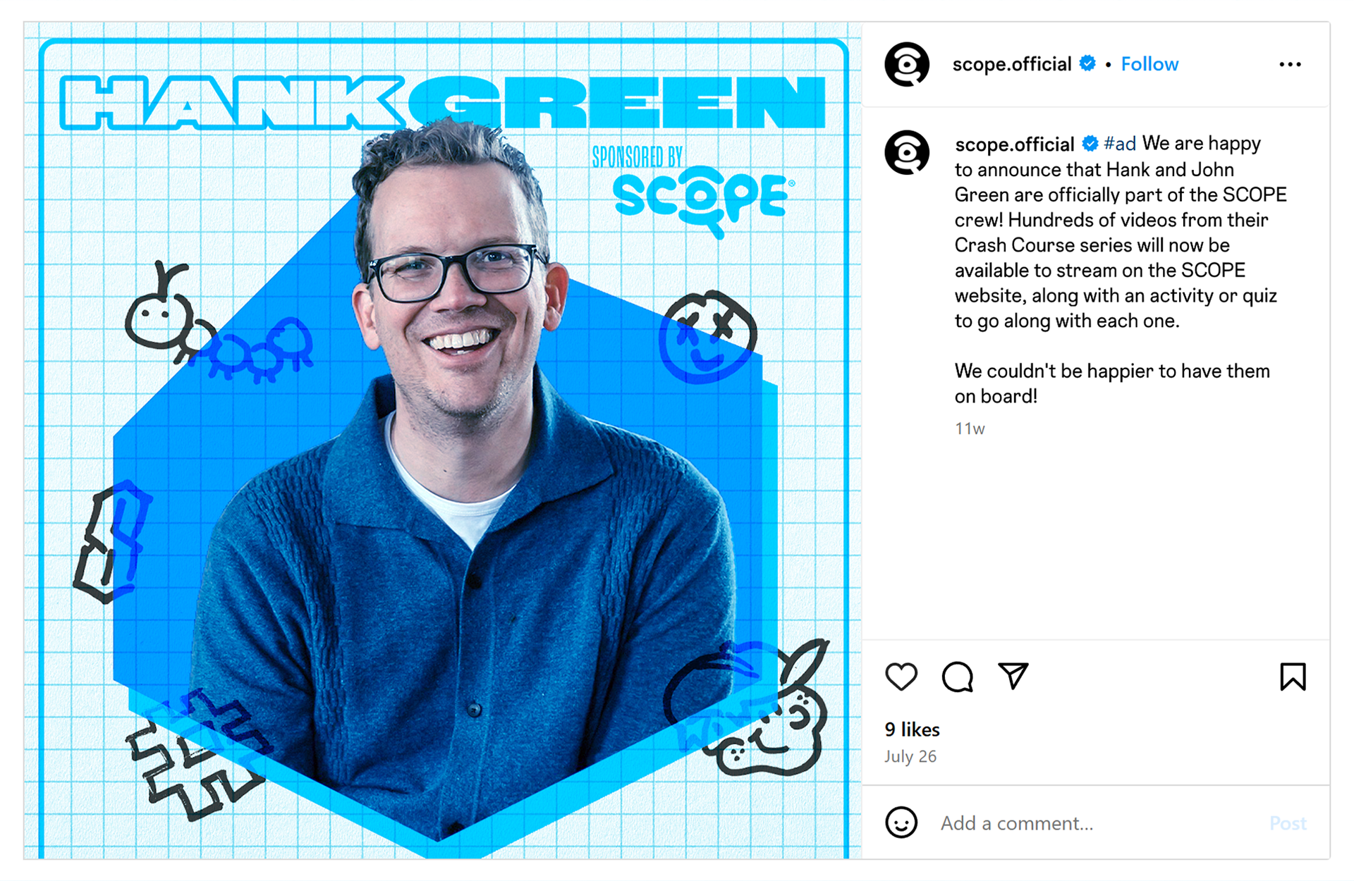
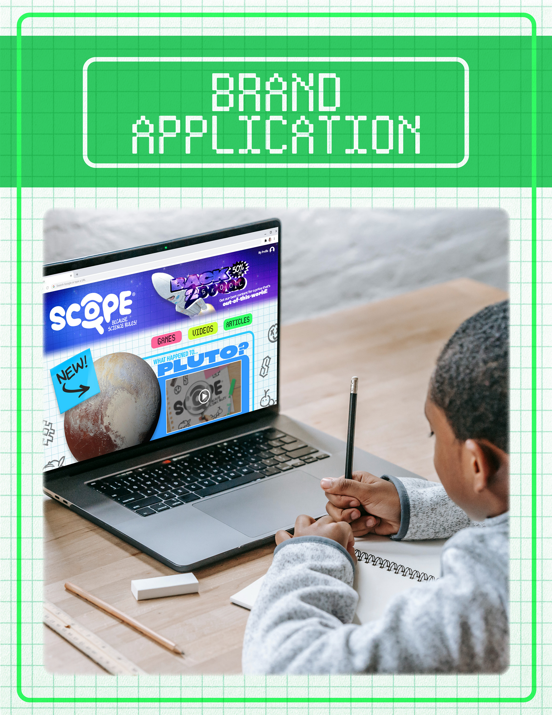
The platform: SCOPE is a content hub for kids featuring news, videos, quizzes, and games centered around science and technology. The guiding principle "Because Science Rules" isn't just a tagline, but the entire personality of the brand. SCOPE is comparable to National Geographic Kids except with a new primary topic of focus, and the platform would partner with well-known names in the science world as well as those produce science content on platforms such as YouTube.
The audience: Kids, primarily, but also the parents and teachers who put content in front of them. Dual audiences shaped every decision because the brand needed to feel exciting and playful for a 10-year-old without feeling cheap or untrustworthy to an adult.
CONTENT — Deliverables
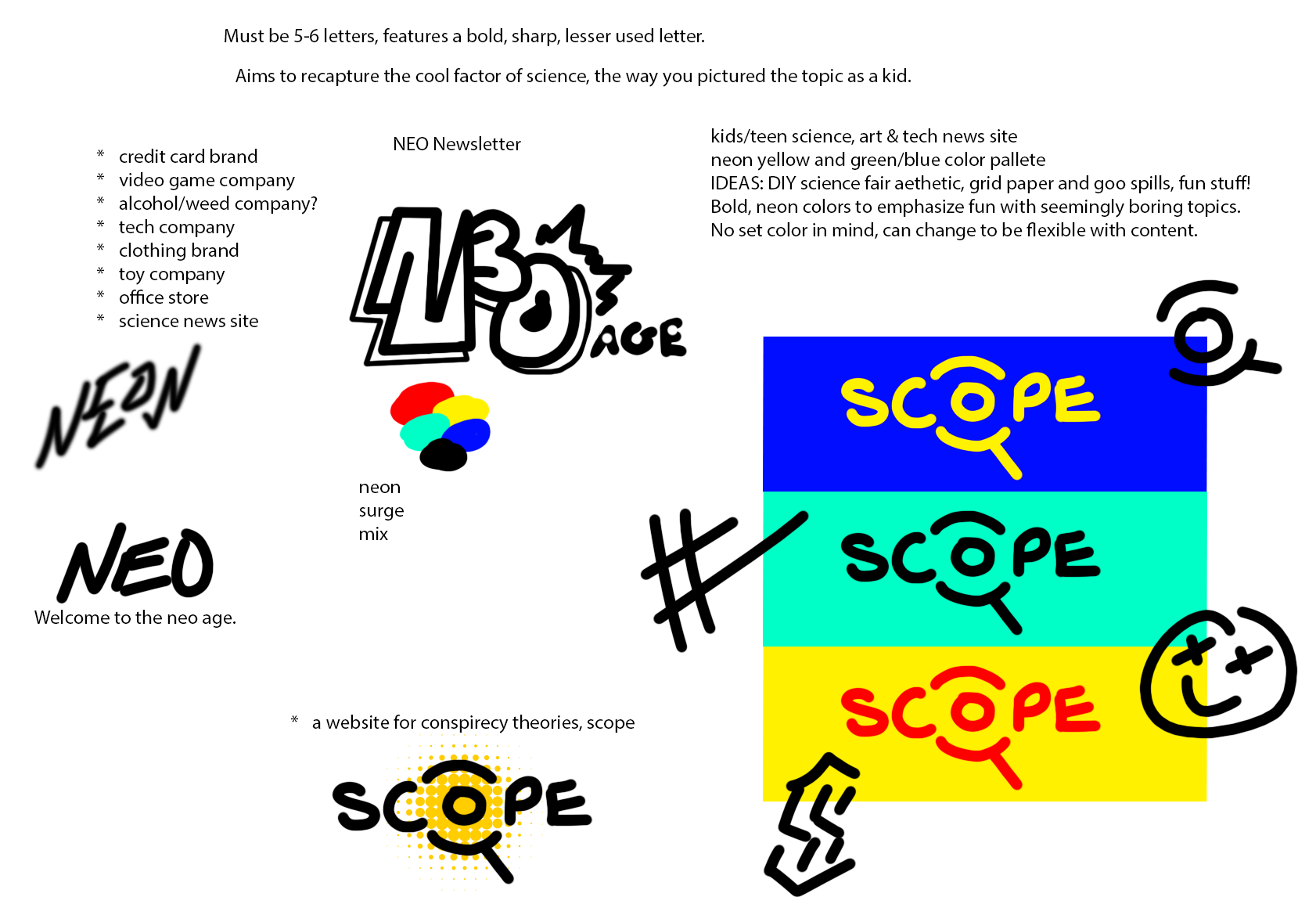
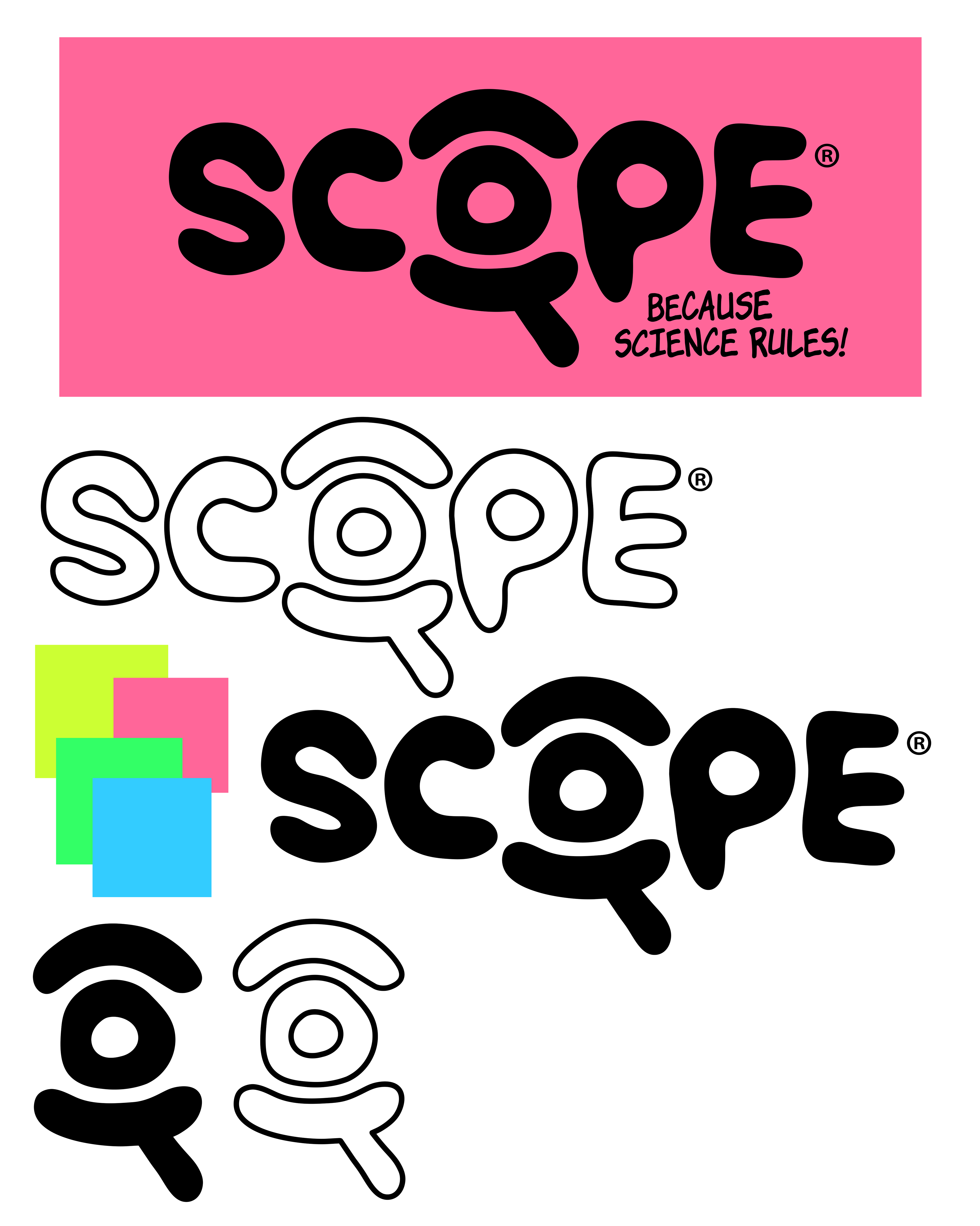
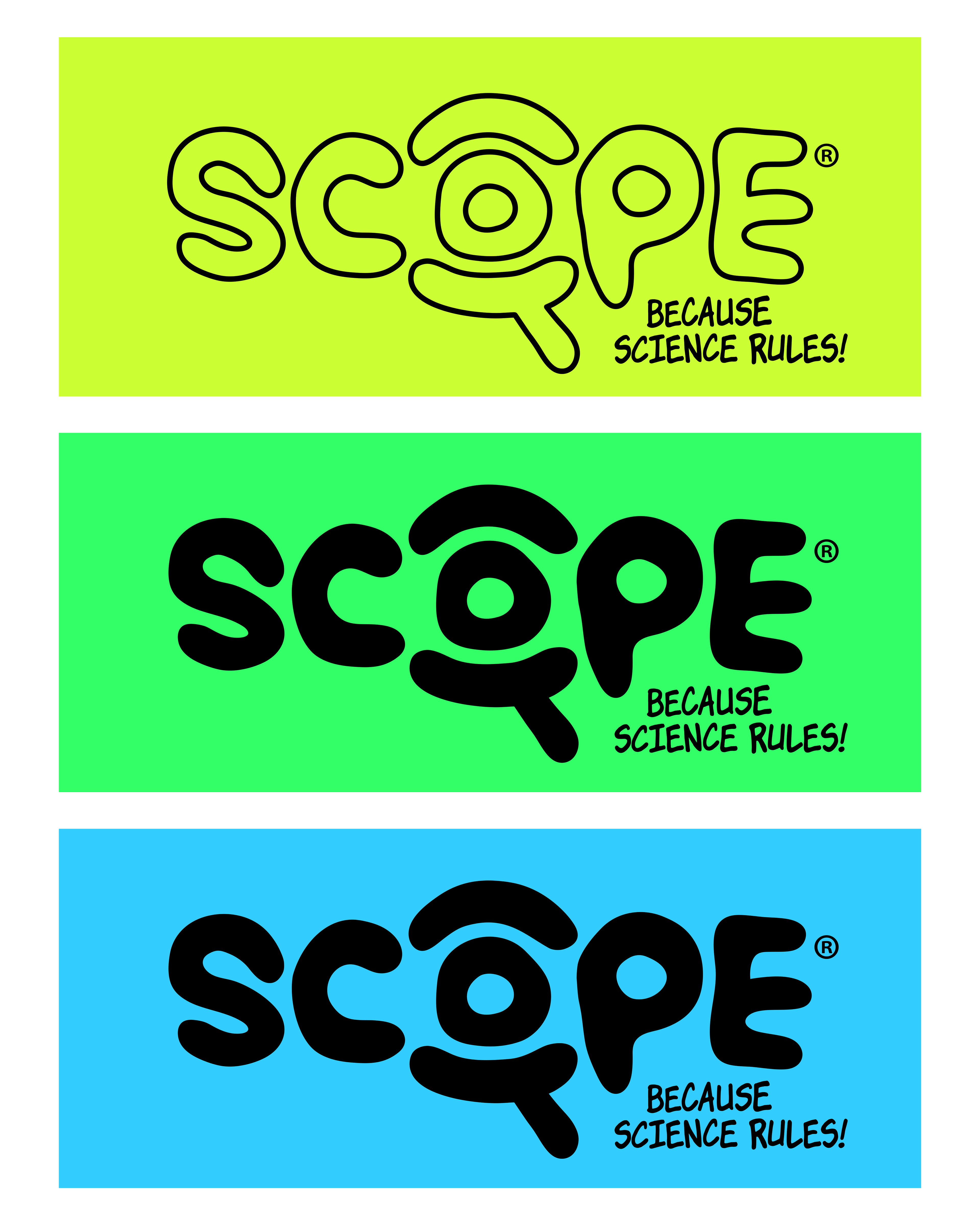
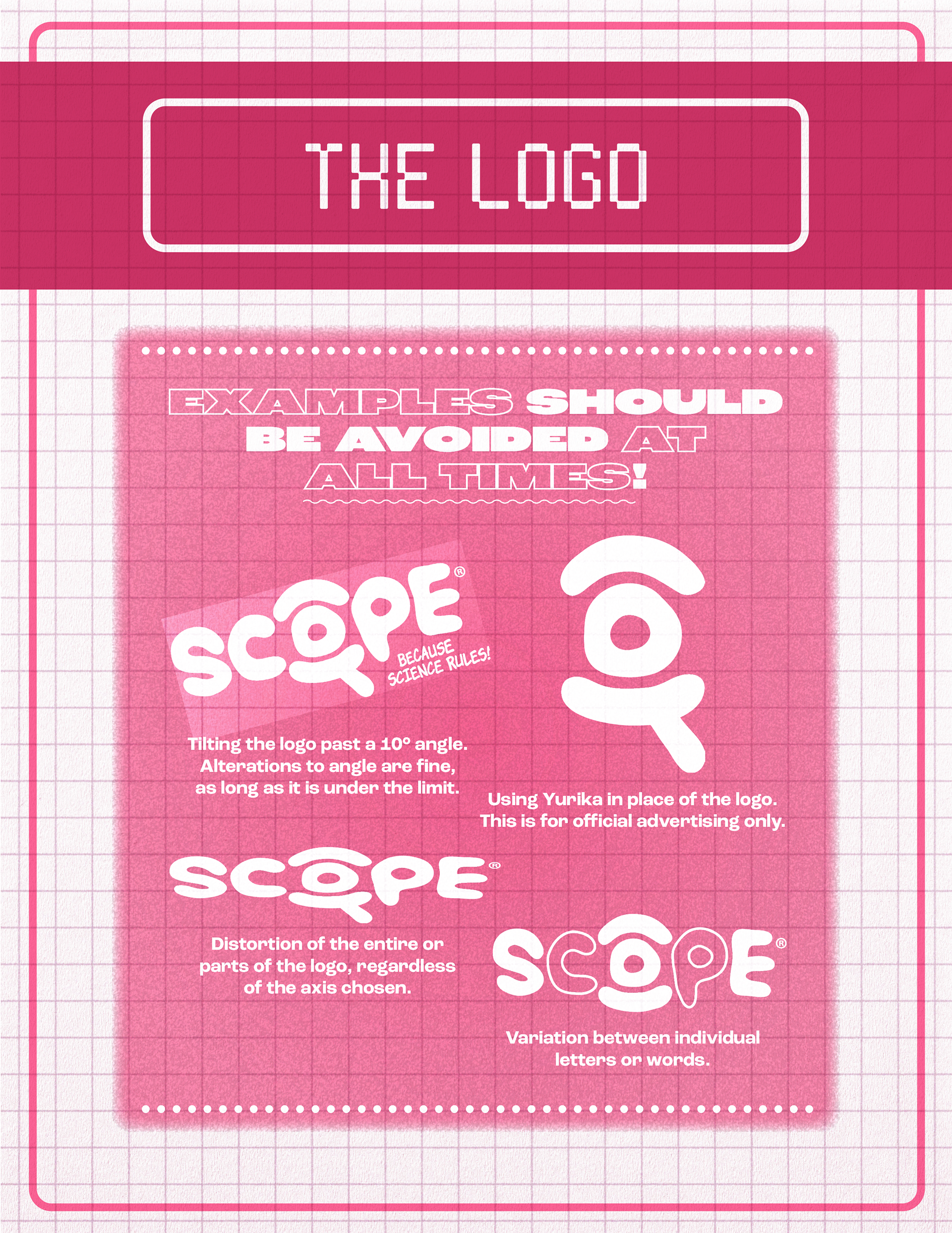
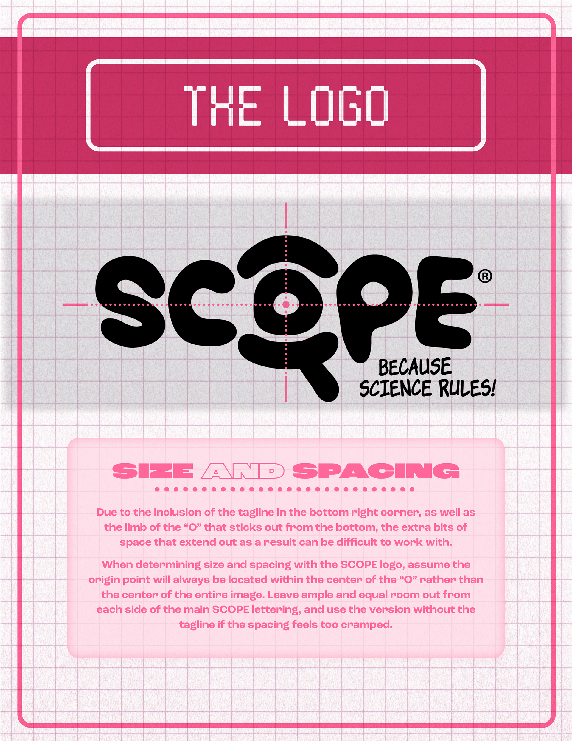
THE LOGO
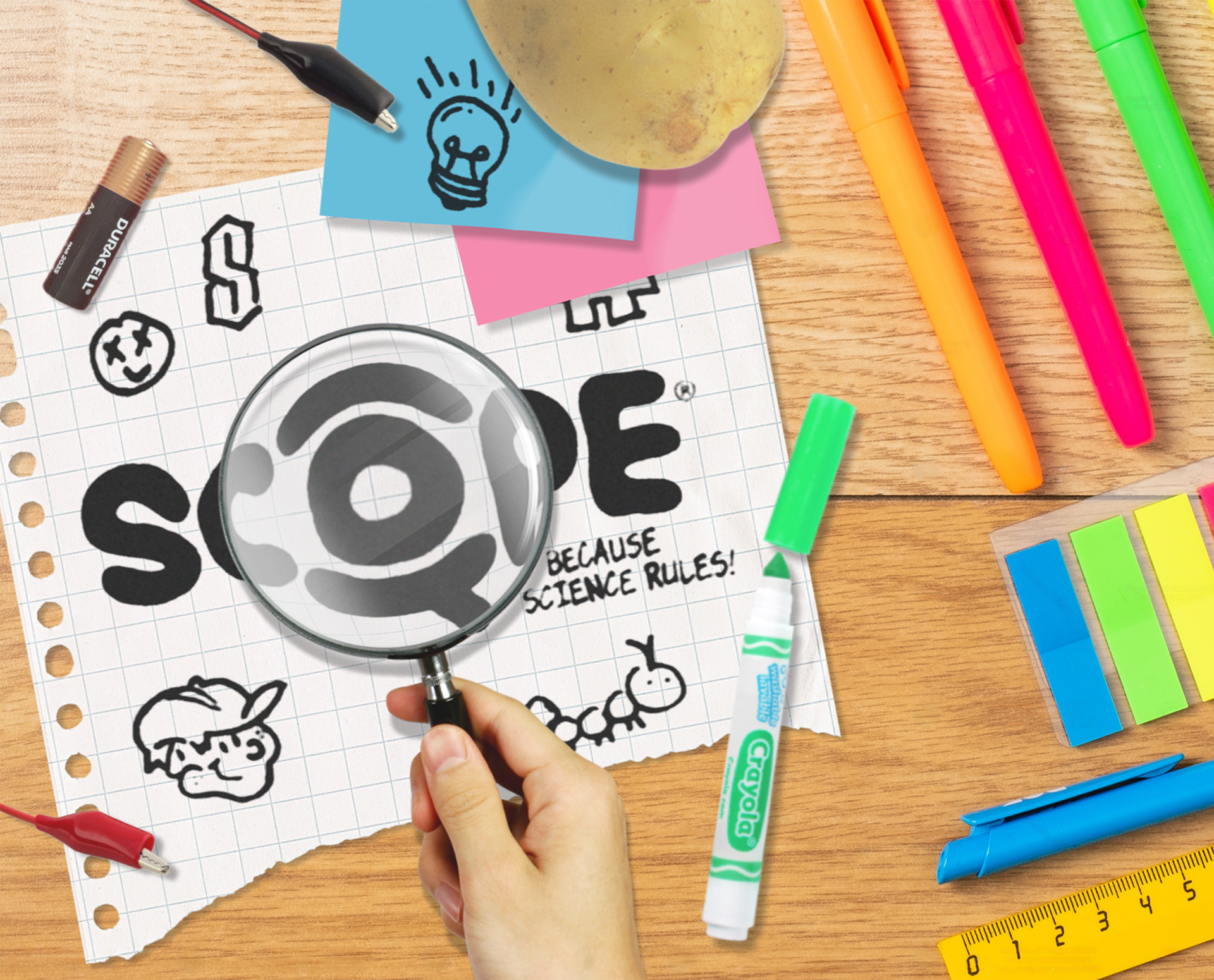
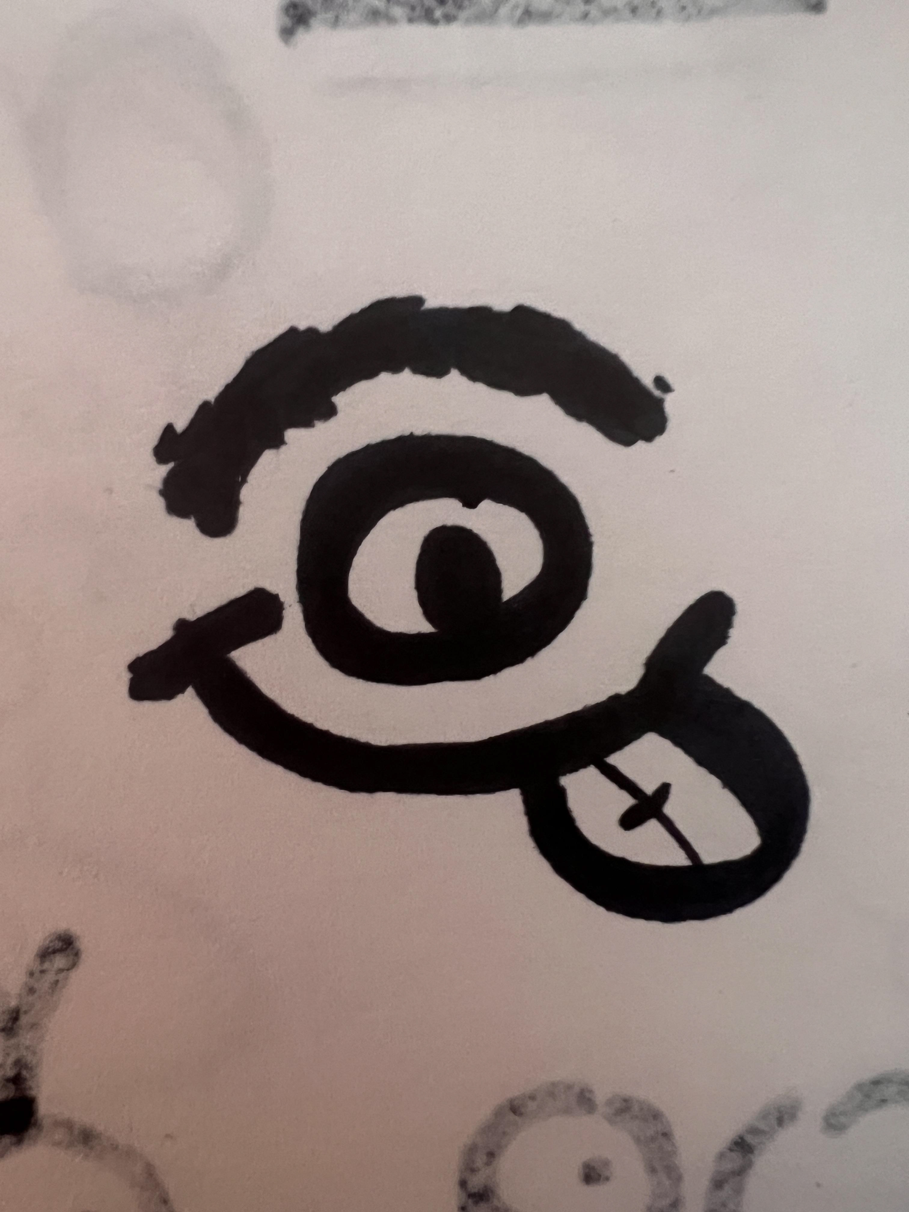
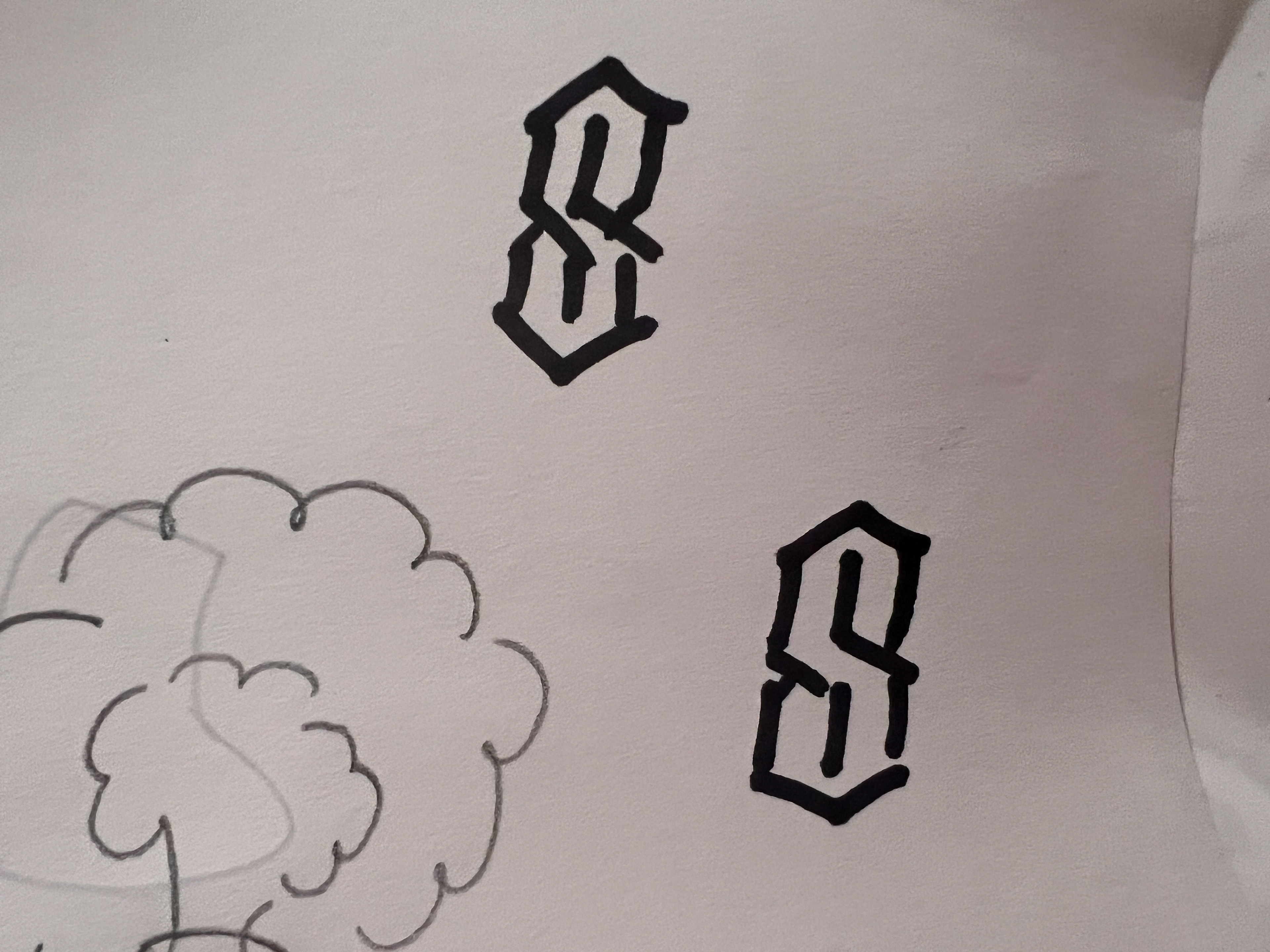
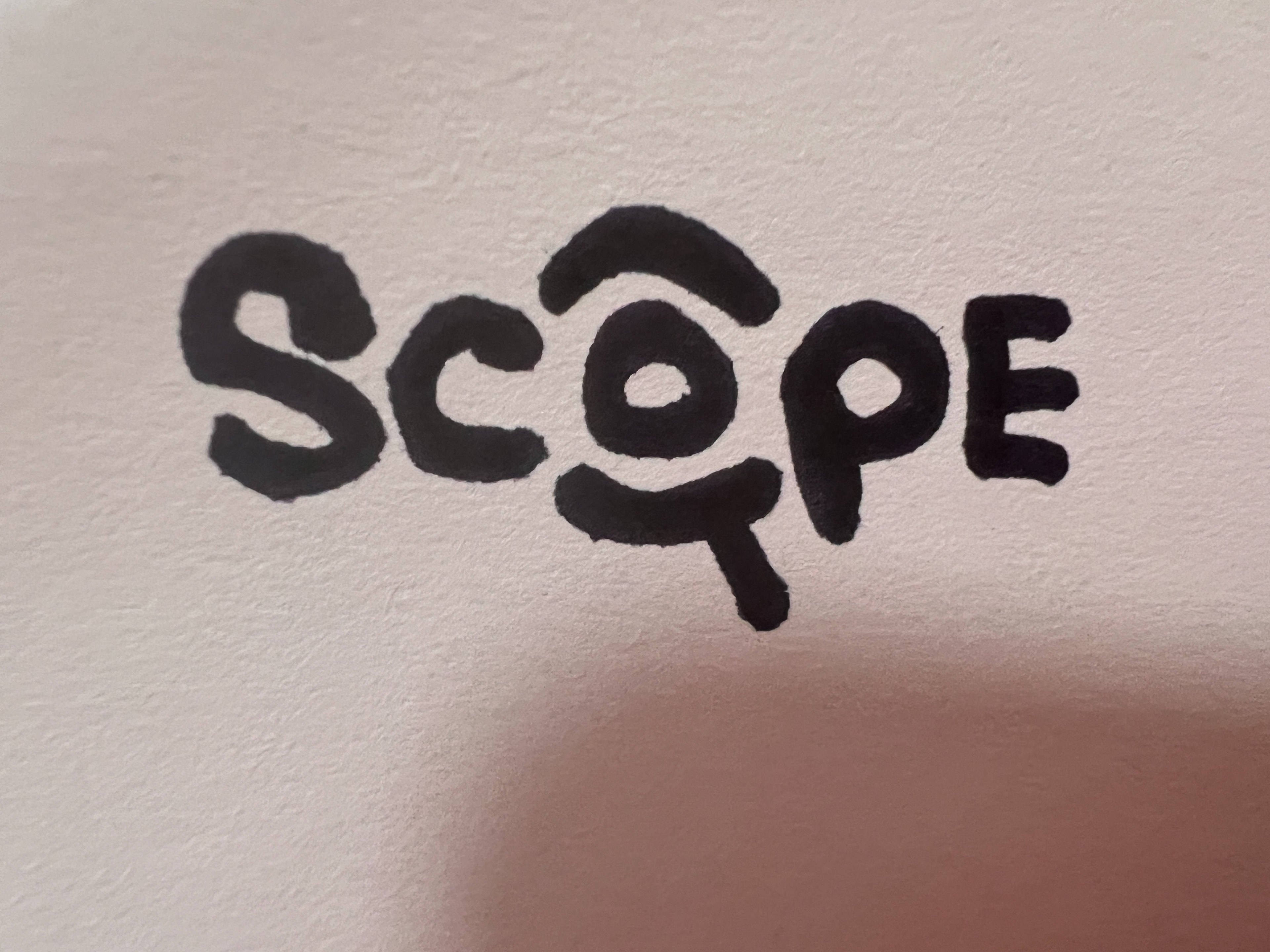
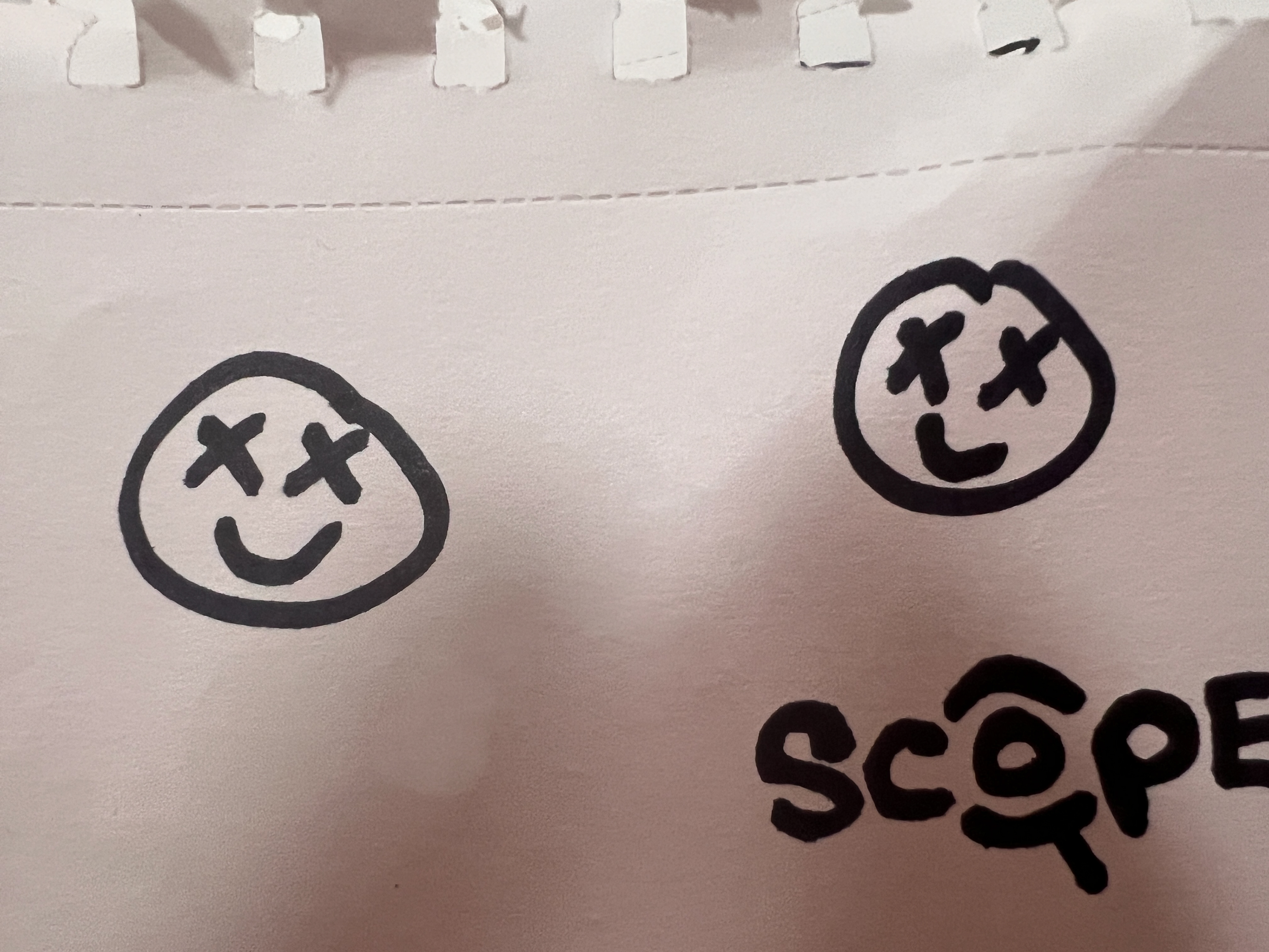
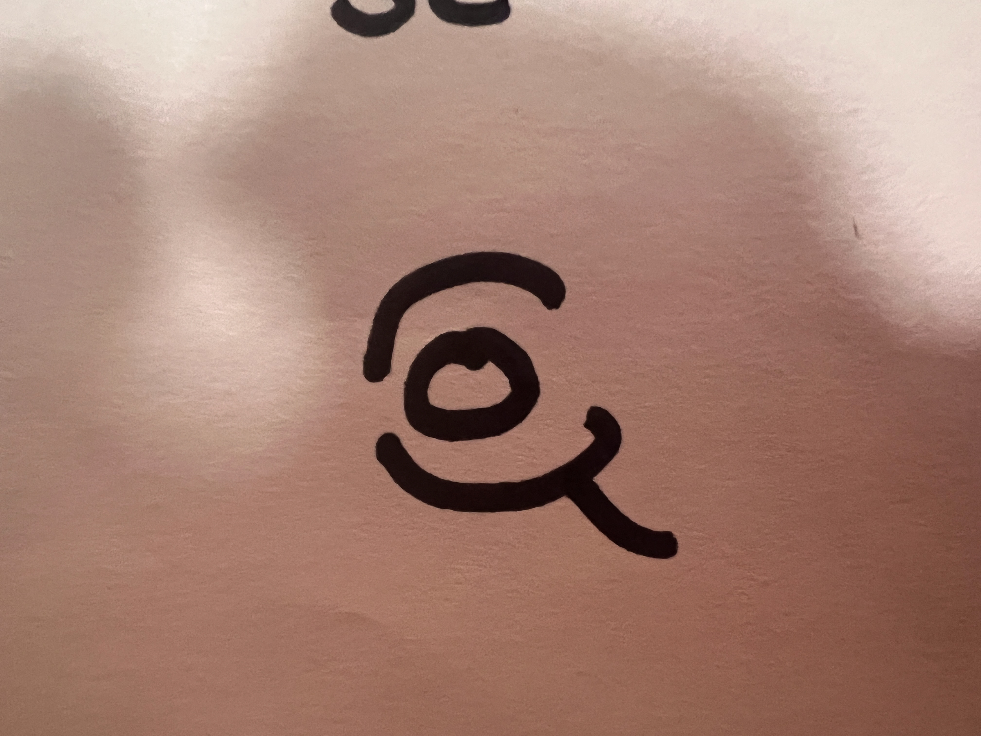
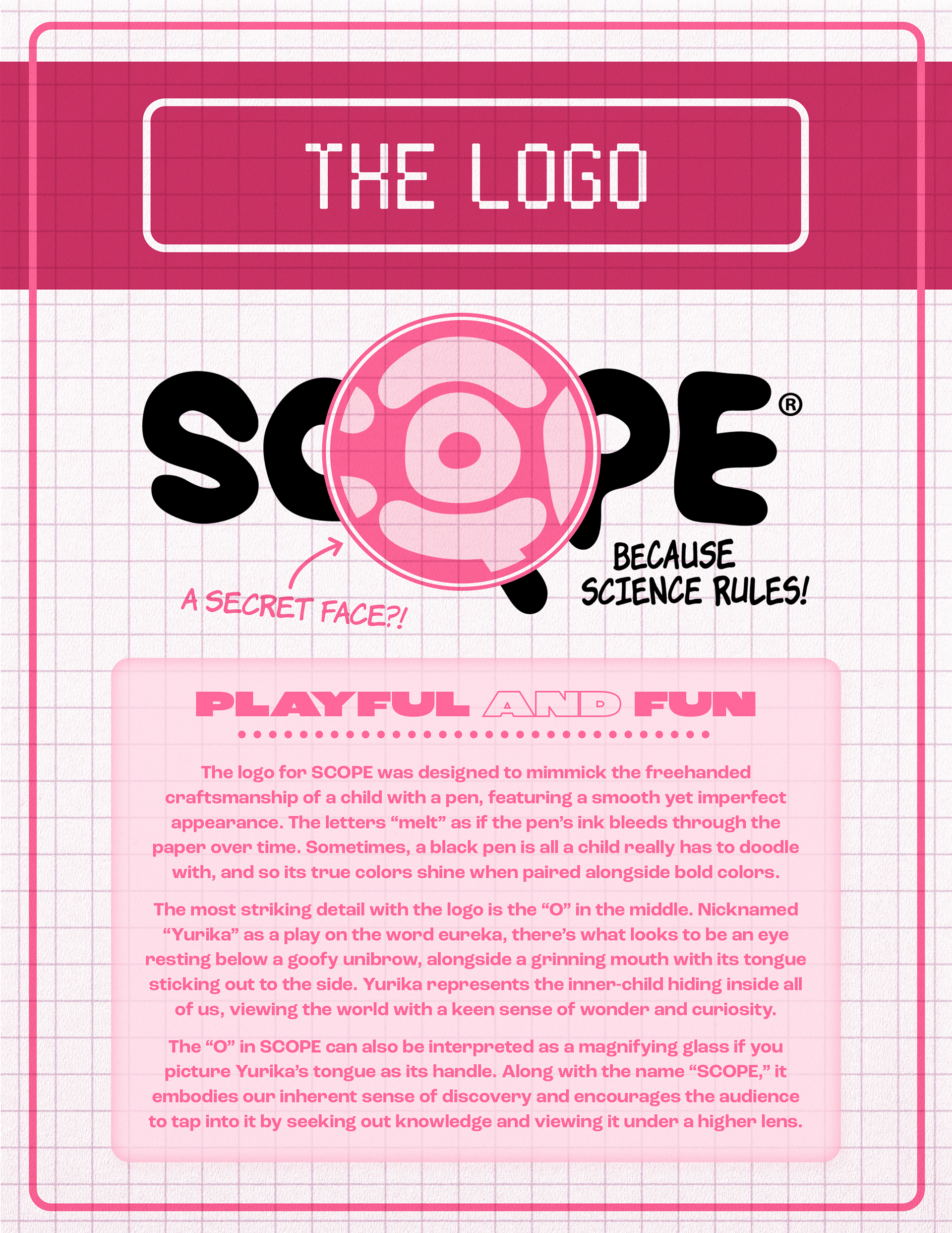
The SCOPE logo was purposefully designed to feel like something a kid drew. The letters have a melted, freehand quality, as if the ink bled through the paper. The centerpiece is the "O," nicknamed Yurika (a play on eureka), which hides a face: an eye, a unibrow, and a tongue sticking out. It doubles as a magnifying glass, nodding to the platform's spirit of discovery. The concept had came fully formed early on and never changed, which honestly doesn't happen often. I trusted it!
COLOR & TYPOGRAPHIC
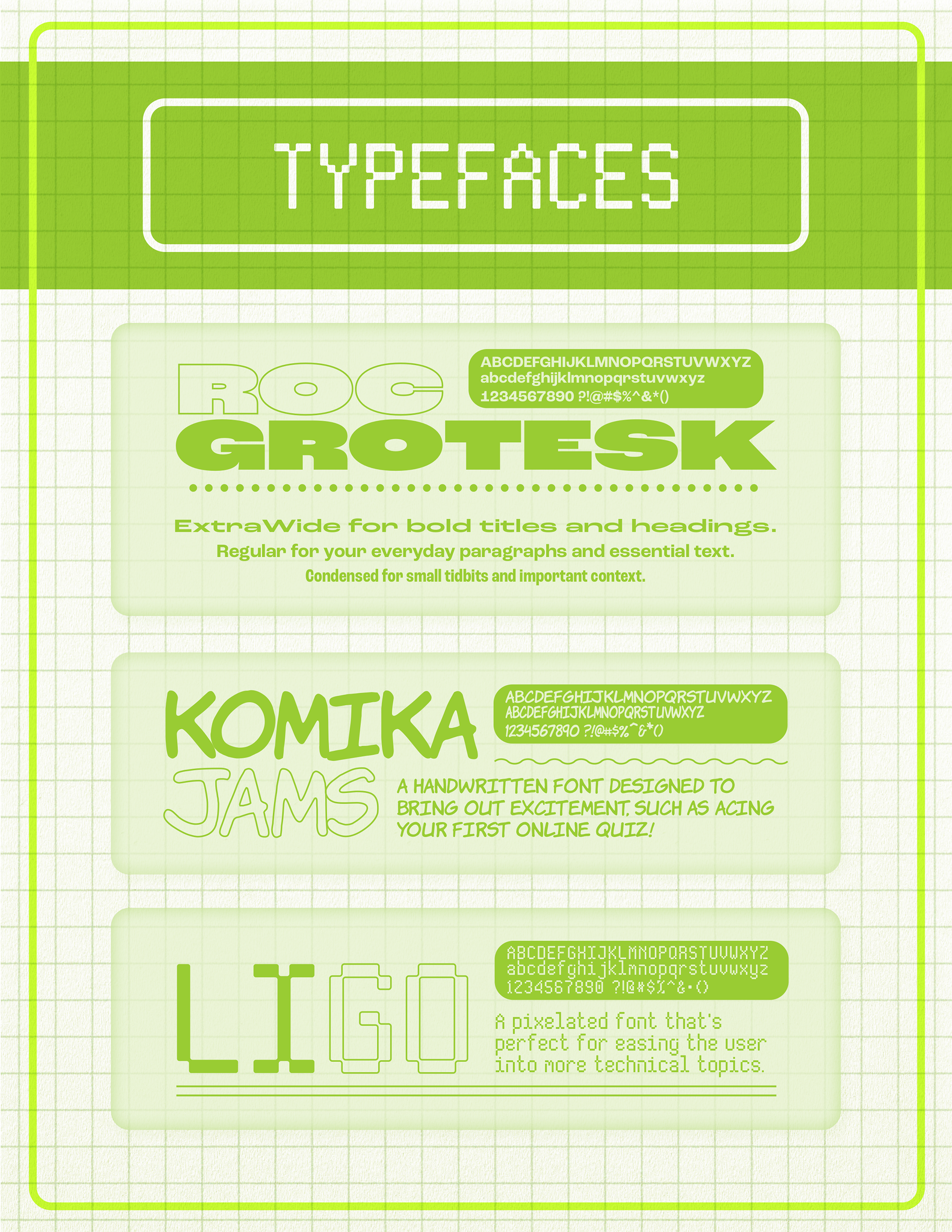
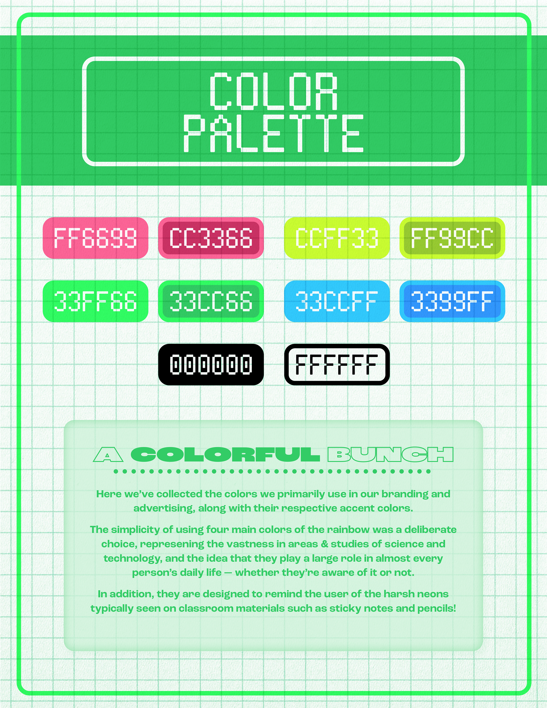
The palette is deliberately loud and features neons pulled straight from classroom supplies like sticky notes, highlighters, pencils. Four core colors (blue, green, pink, lime) represent the spectrum of science as a subject. Typography pairs Roc Grotesk for structure, Komika Jams for energy, and Ligo for anything technical.
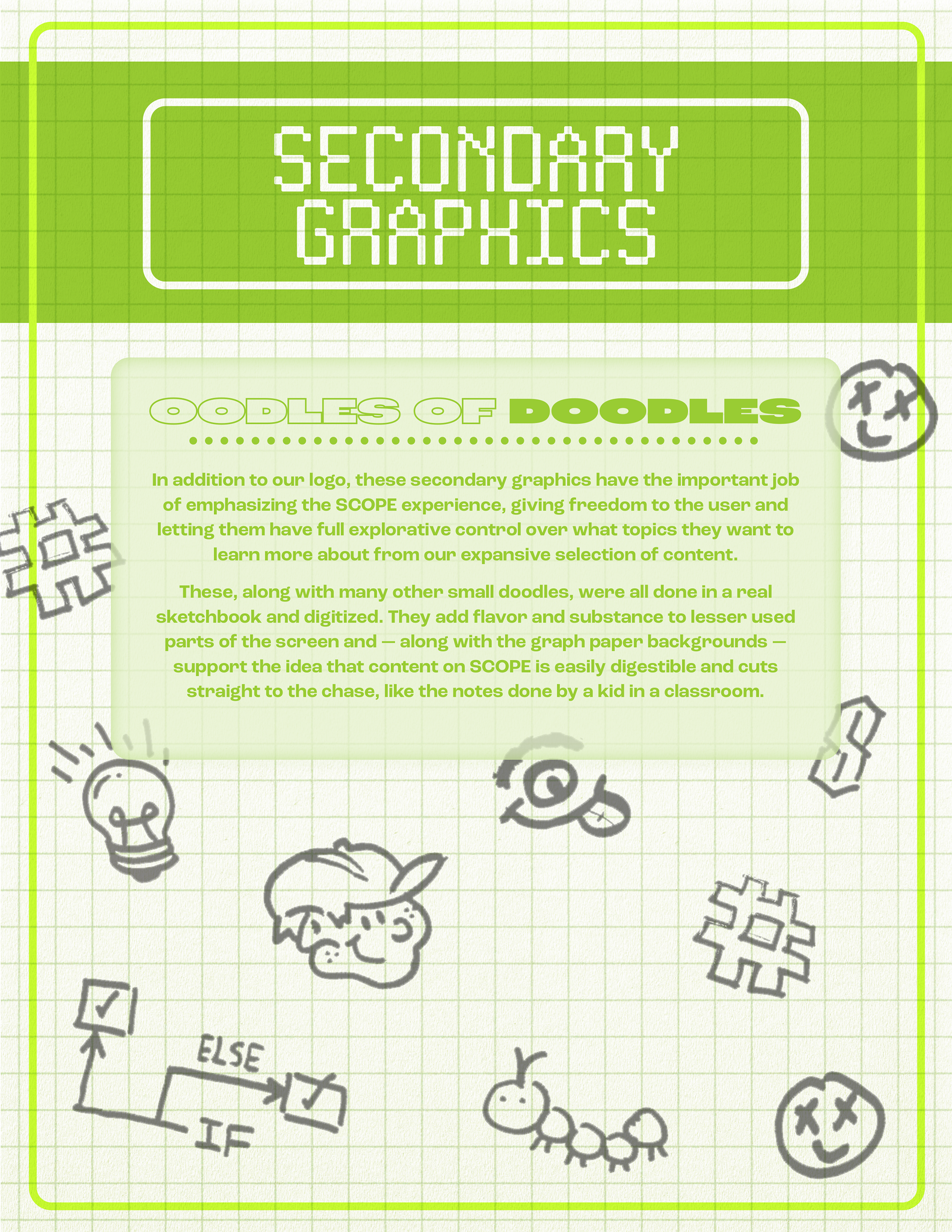
SECONDARY GRAPHICS & ILLUSTRATIONS
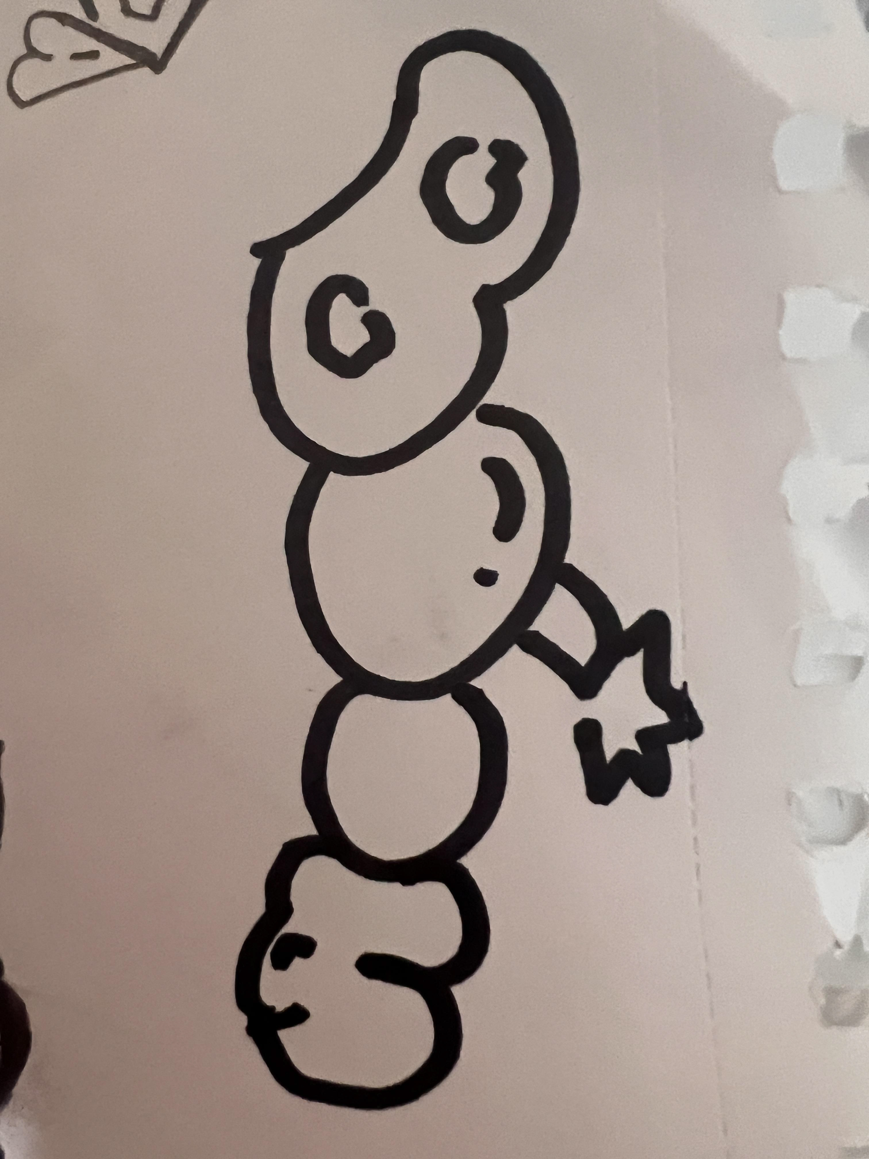
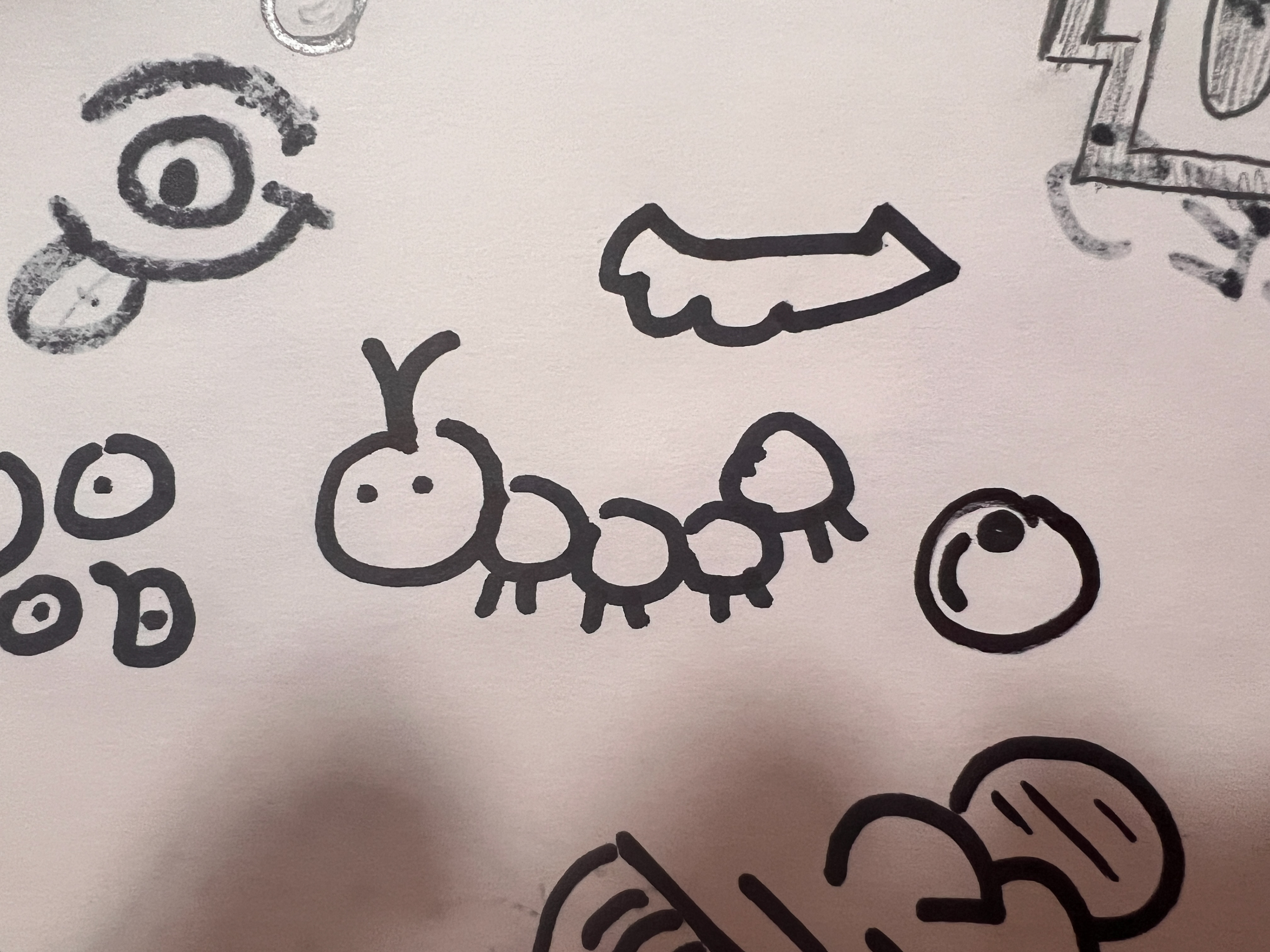
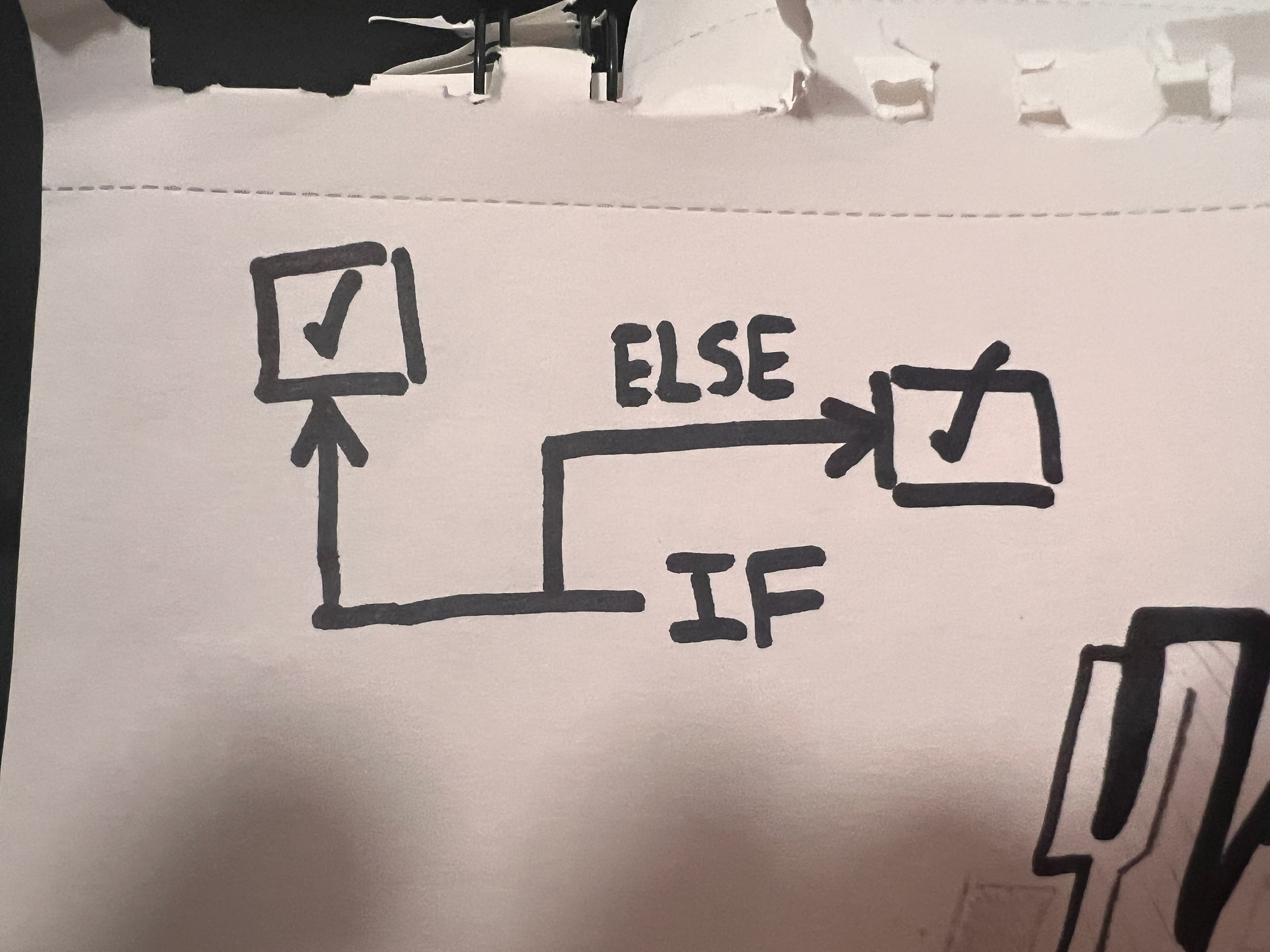
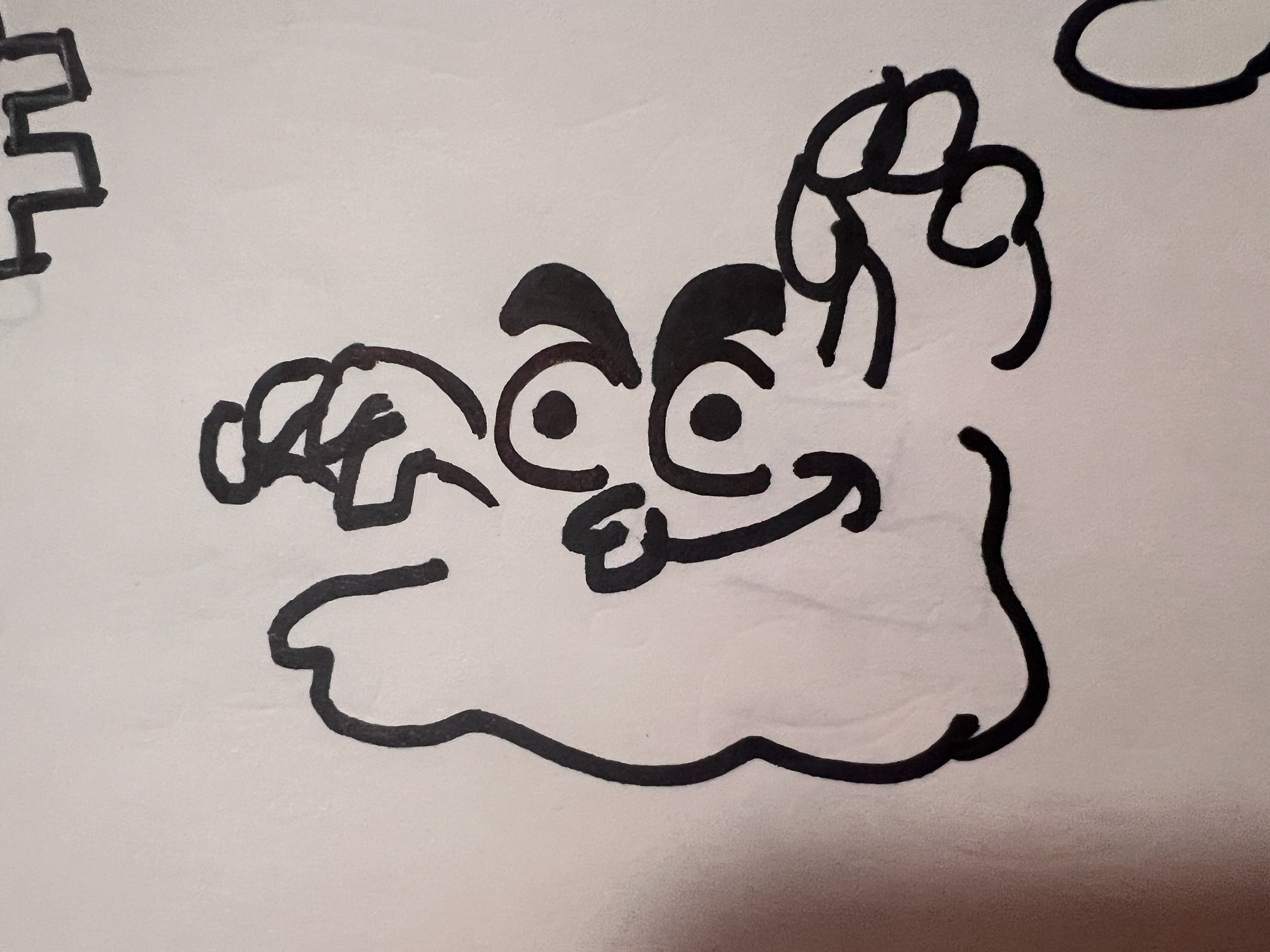
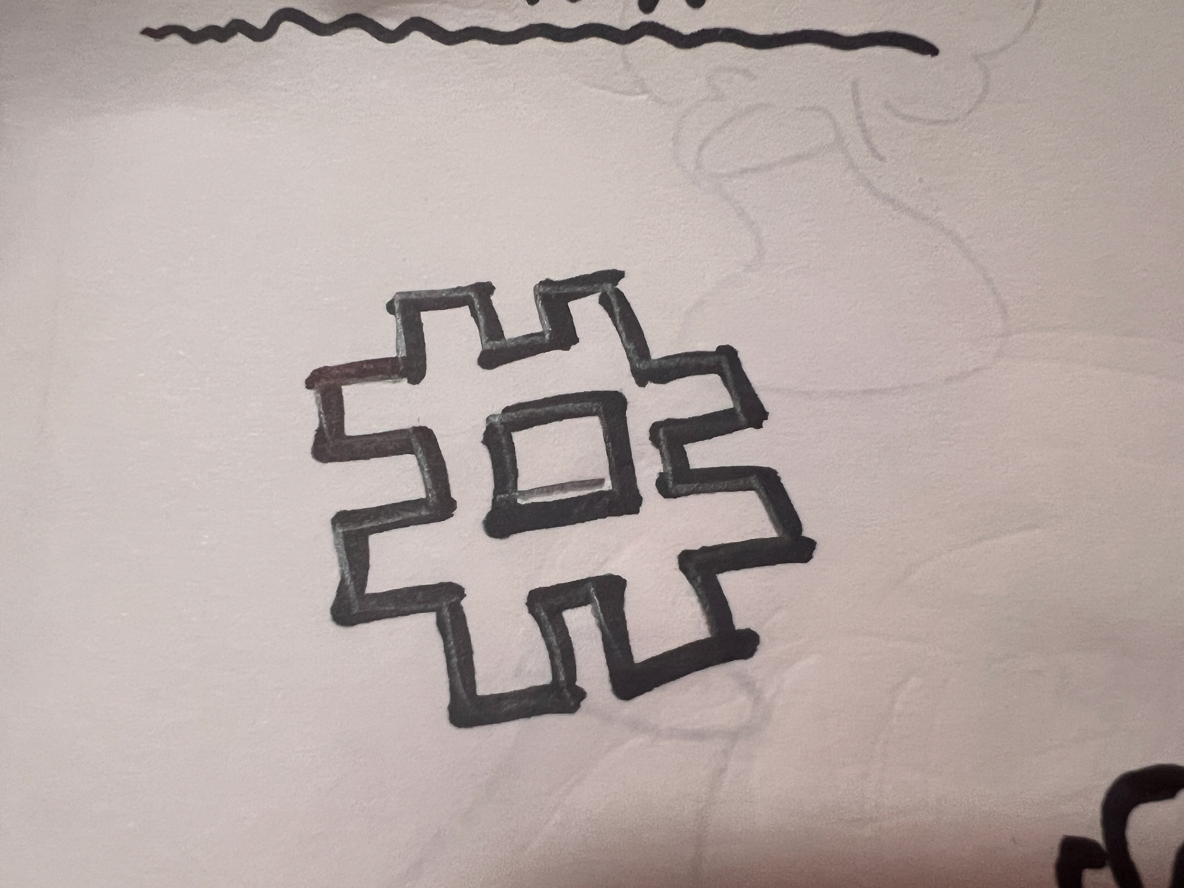
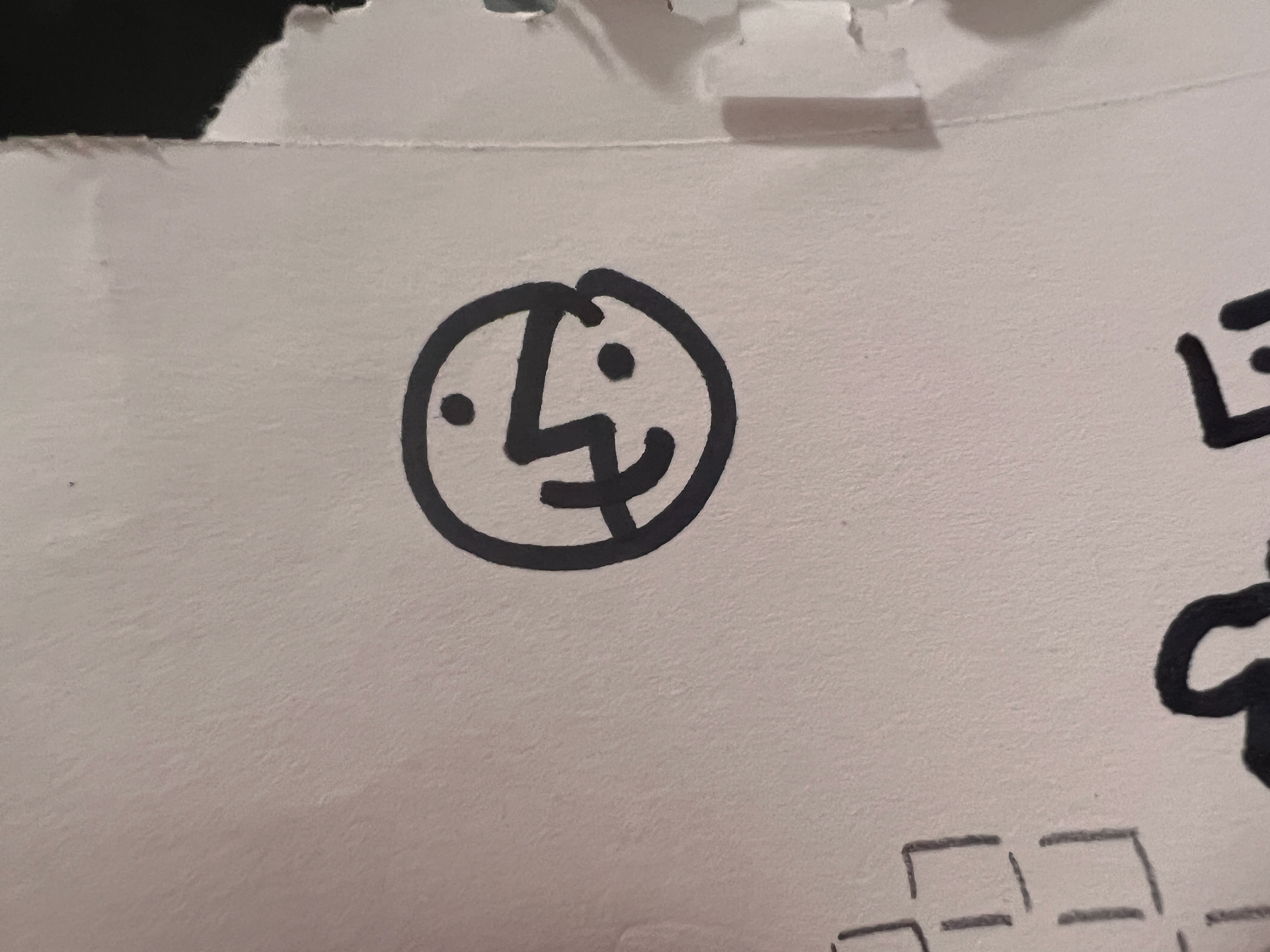
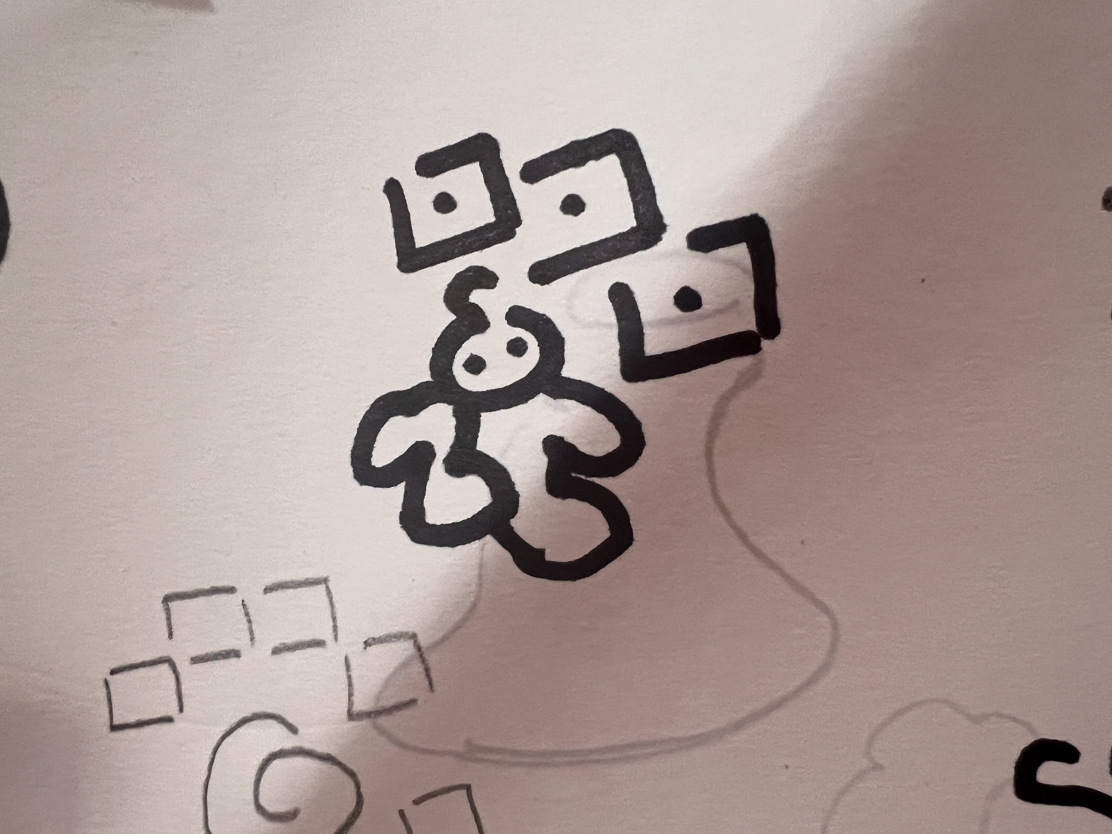
All secondary doodles were hand-drawn in a real sketchbook and digitized in Illustrator. They fill the margins of the UI (think a lightbulb, a caterpillar, an if/else flowchart) and reinforce the idea that SCOPE content is like a kid's notebook: messy, curious, and alive. The graph paper background system ties everything together, don’t you think? Well, I think so at least.
MOTION GRAPHICS
Every video on the platform opens with a short branded intro!
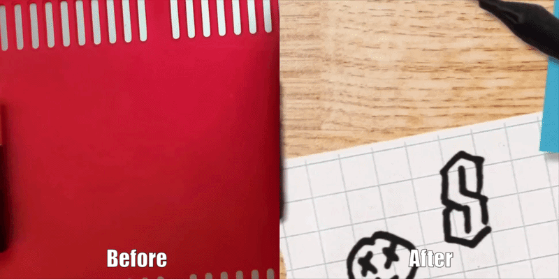
I built it in Final Cut Pro around a desk scene with animated props including a battery that physically rolls into frame. That battery is real. I filmed it rolling, green-screened it out, and composited it into the scene.
The choppy frame-rate was an artistic choice in order to replicate the stylings of stop motion and comic-like visuals, but if I were to revisit this assignment again I feel like I would try to adjust it so it looks more natural. To manage the complexity of the animation I had to learn compound clips in FCP from scratch, which strained my computer in many ways but the process got easier and faster the more I did it. Little elements such as Yurika giving you a wink as the magnifying glass approaches is a small detail most viewers won't think about, but it's the kind of thing that makes the whole thing feel tactile and real.
VISUAL STANDARDS DOCUMENT
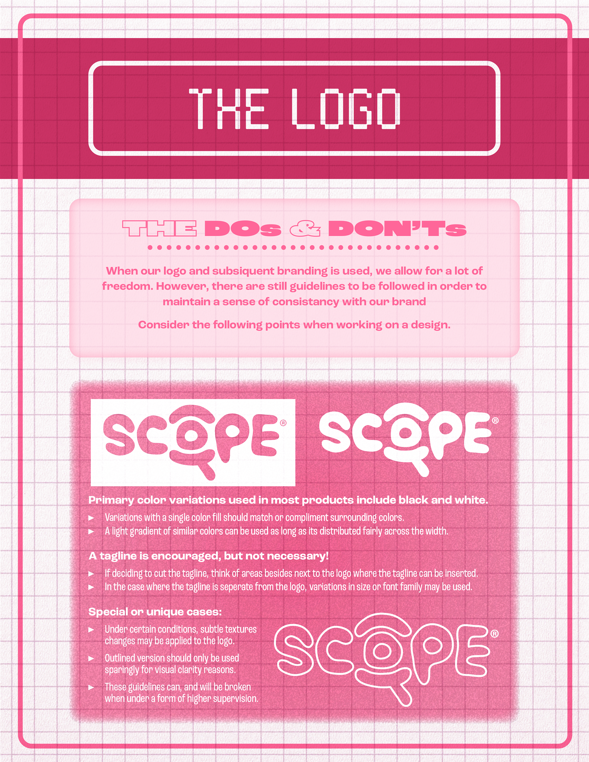
My final deliverable was a full brand guide built in InDesign with logo dos and don'ts, spacing rules, color values, typeface usage, and application examples. The document itself is designed to look like SCOPE content: grid paper backgrounds, the same fonts and colors, section headers in Ligo. It's a brand guide that lives inside the brand itself, which I think makes it feel super unique AND helpful for the viewer!

CLOSURE — ReflectioN
Taking a one-week logo assignment and turning it into a full brand system was entirely self-imposed, and that's the part I'm most proud of. No one asked for a visual standards document. No one asked for a motion bumper with a green-screened battery. I just wanted to see how far I could push it.
The biggest takeaway: a strong concept at the start gives you enormous freedom later. Because the logo idea was solid from day one, I never had to second-guess the direction. I could just keep building on top of it.