
Type: Print Design
Role: Solo Designer
Duration: 1 Week
Tools: Adobe Photoshop, InDesign, Blender
Role: Solo Designer
Duration: 1 Week
Tools: Adobe Photoshop, InDesign, Blender
INTRO — The Ask
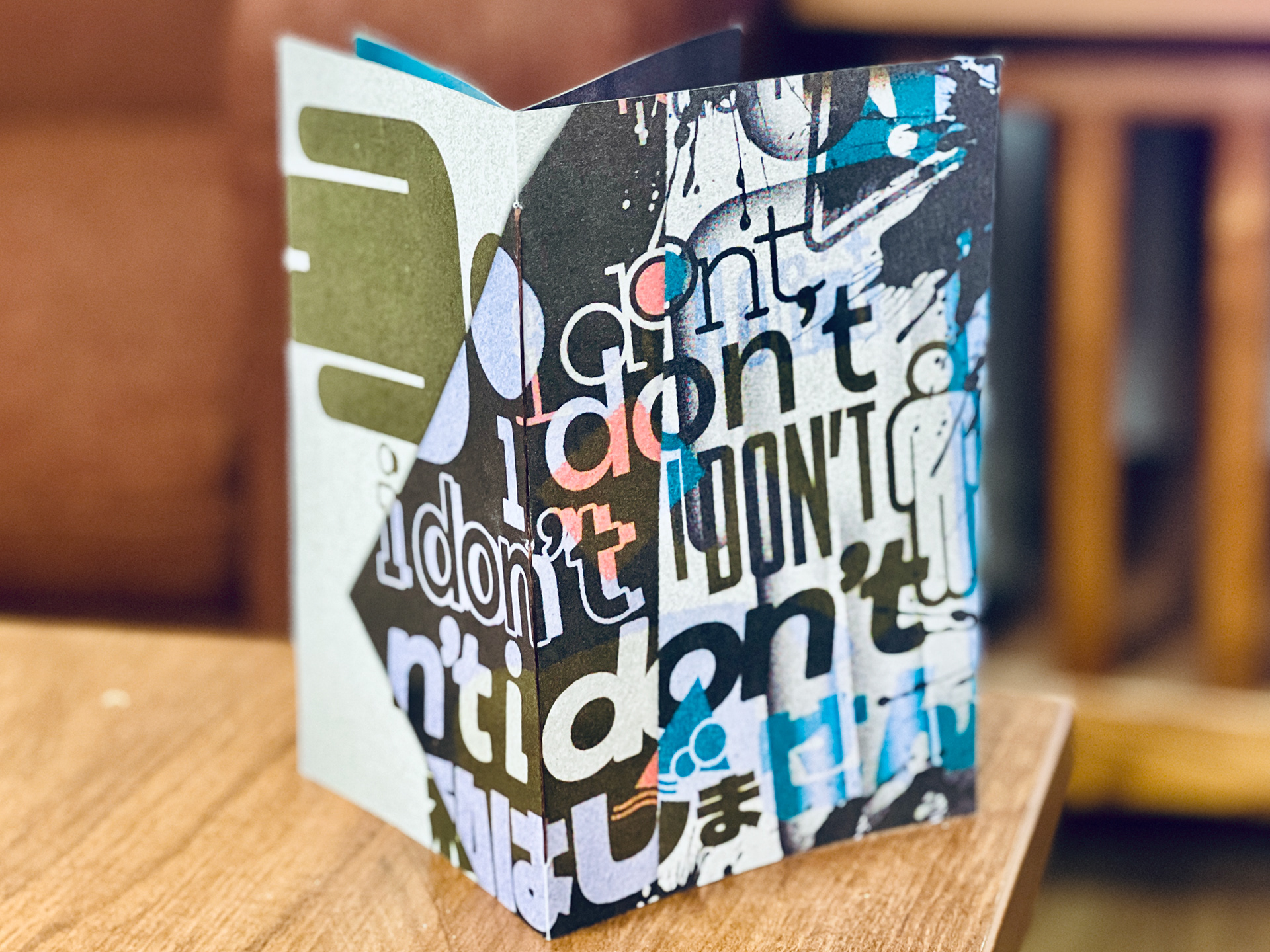
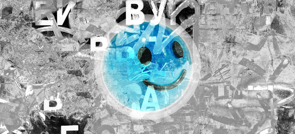
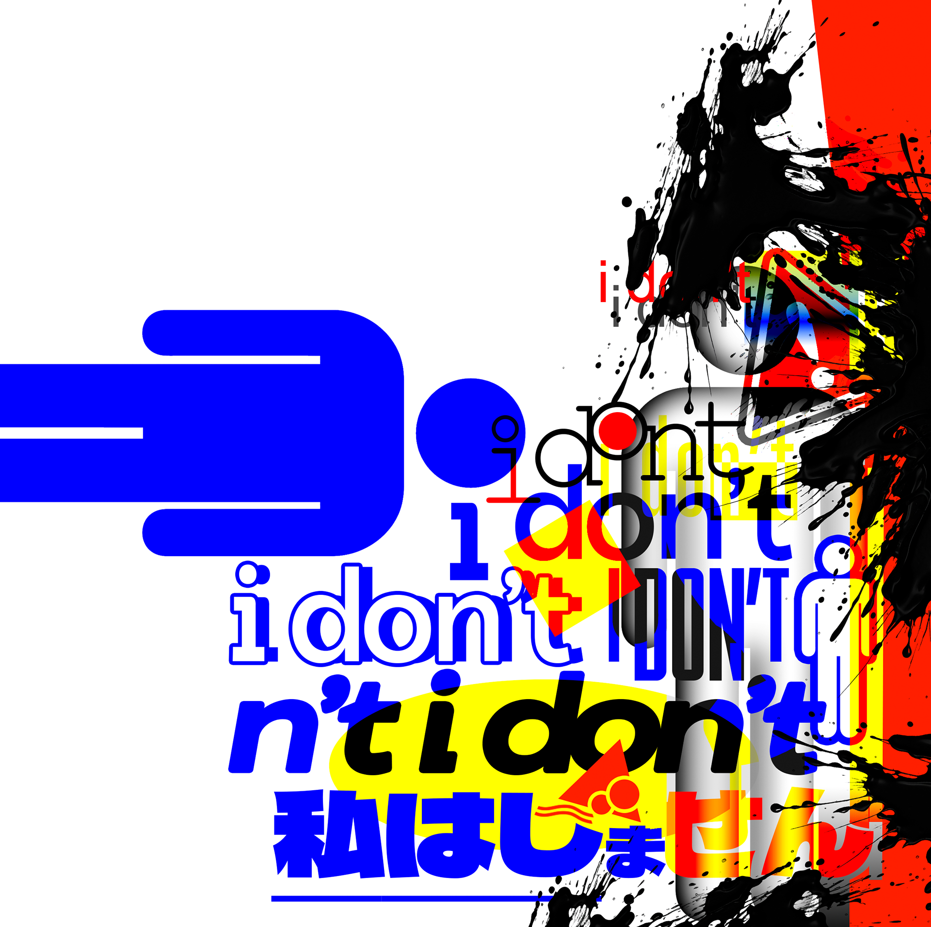
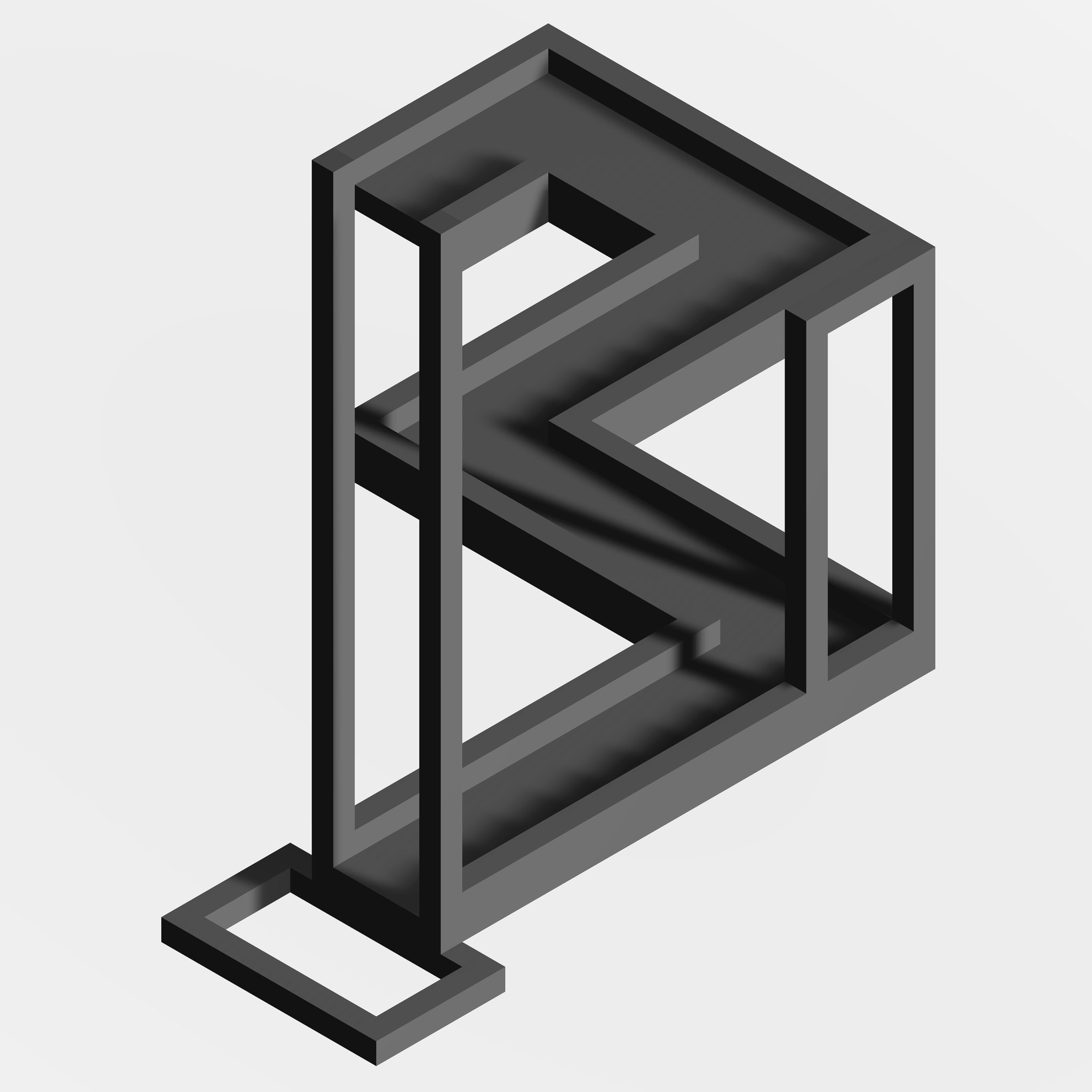
This Zine was always meant to be just a class project, but over the years it became something much more sentimental. "I Don't" is a multi-page grunge zine built around my experiences feeling overwhelmed and overstimulated during the process of finding myself. There are other personal aspects to it as well, but I'd rather not get into them here. The title functions as an incomplete sentence: a refusal, a hesitation, a thing left unsaid. That tension drove every design decision. The image below shows the very first piece intended for this project, but ultimately I ended up going in a different direction.
The format: A hand-printed/photocopied-aesthetic zine built digitally in Photoshop. The finished product has a spine woven of string, contains 3 multi-page spreads, and leans heavily into the grunge aesthetic through typographic chaos, aggressive layering, and artificial grain.
The audience: While this was a graded assignment, the intended audience for this zine is me and me alone.
CONTENT — Deliverables
VISUAL LANGUAGE
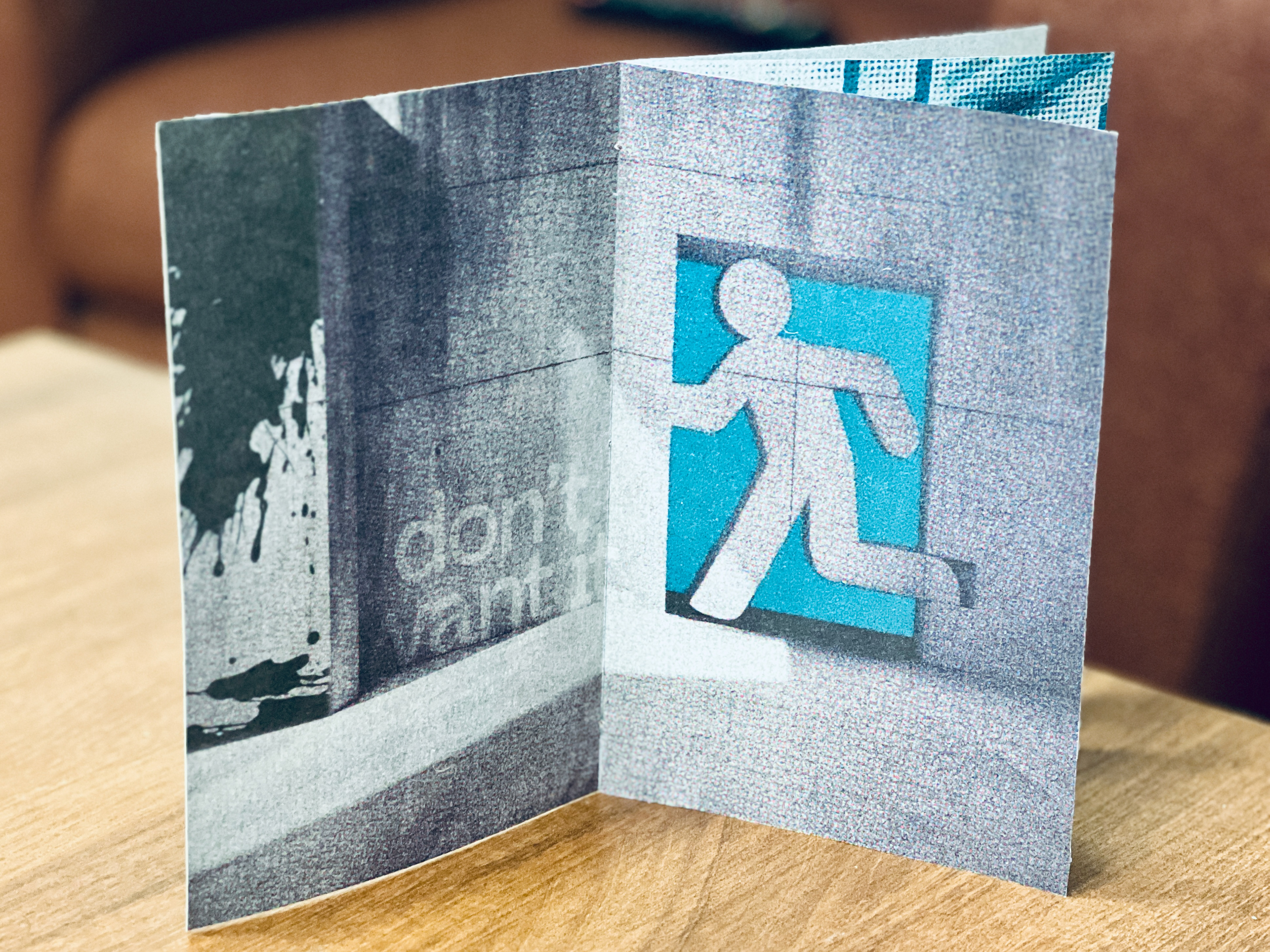
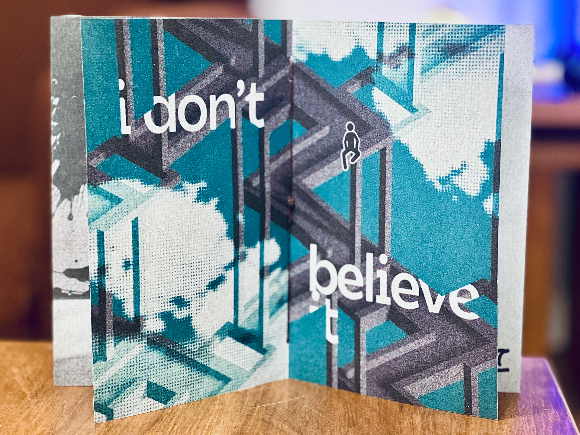
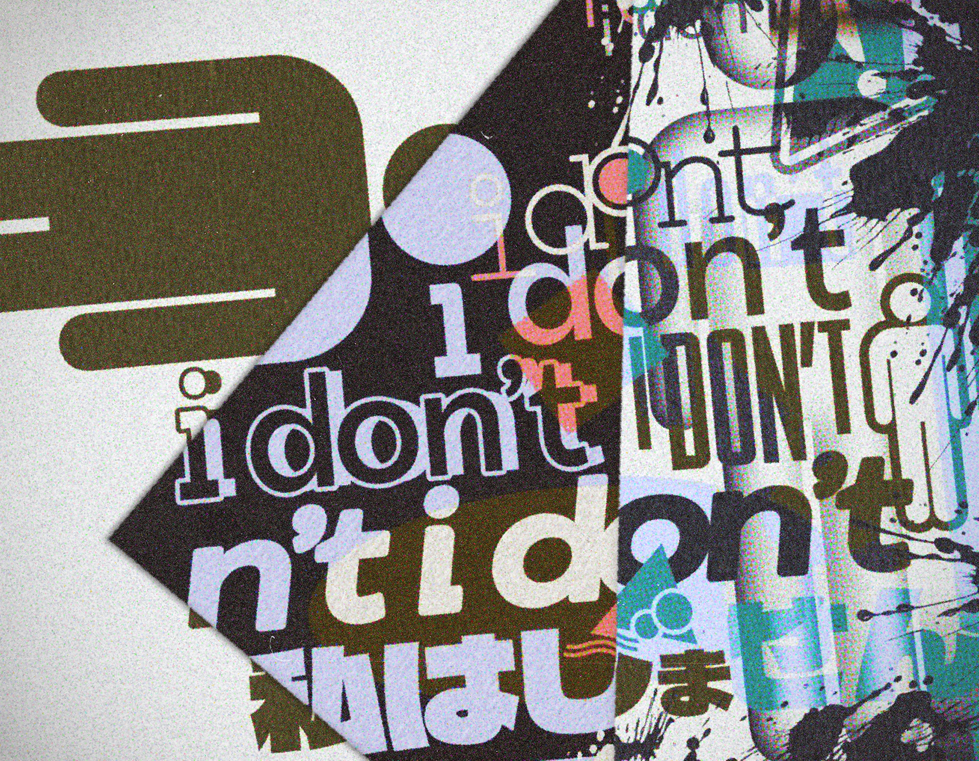
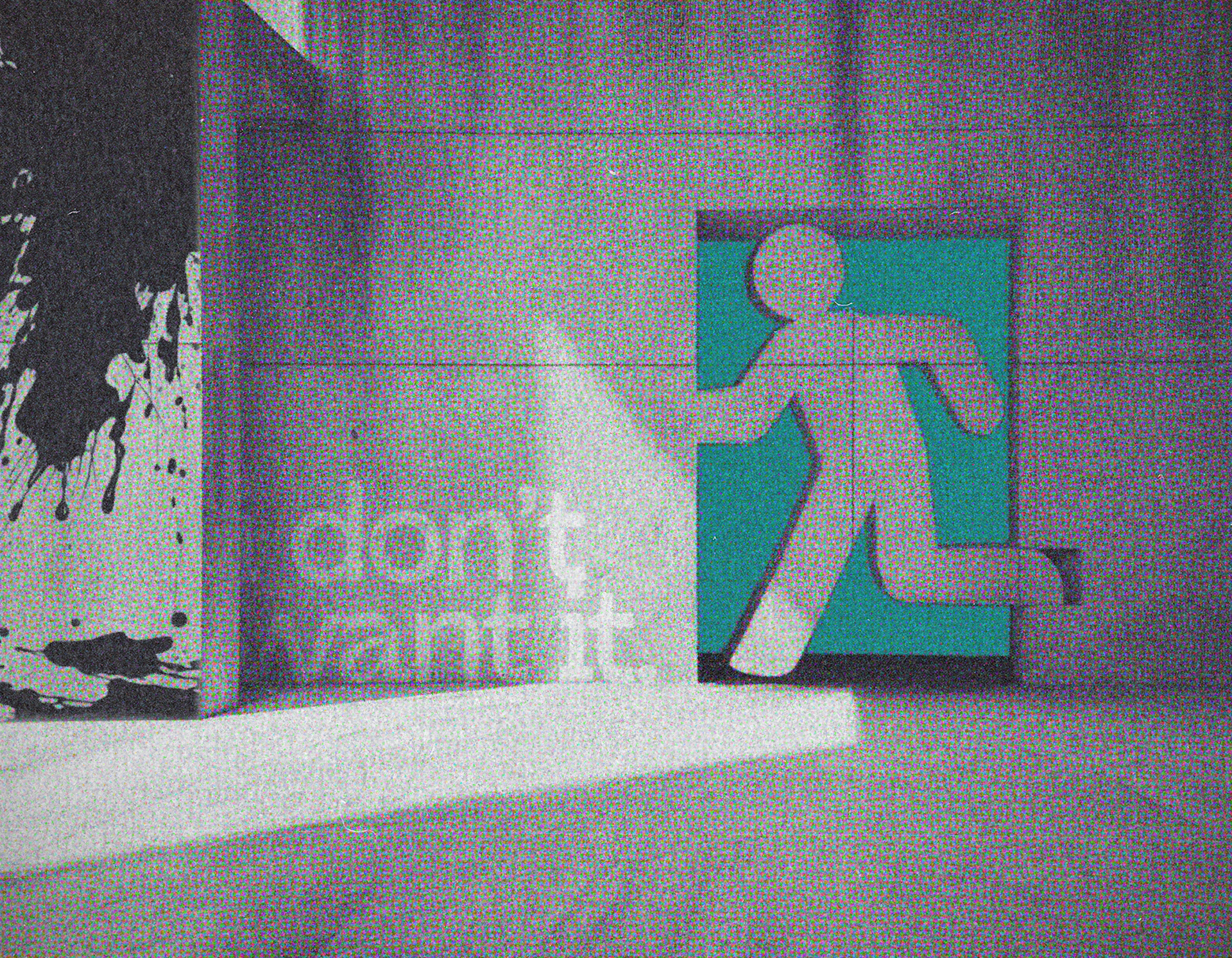
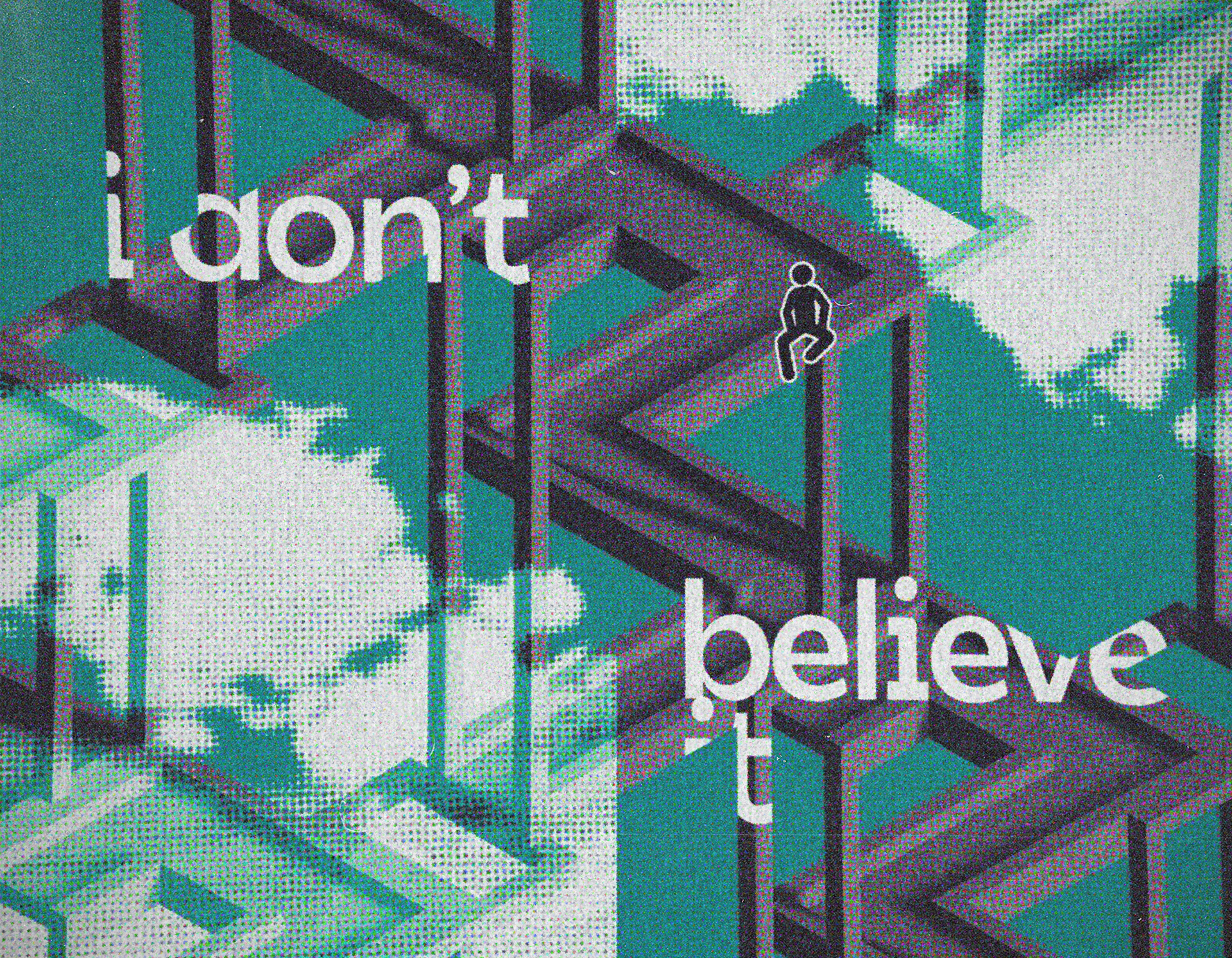
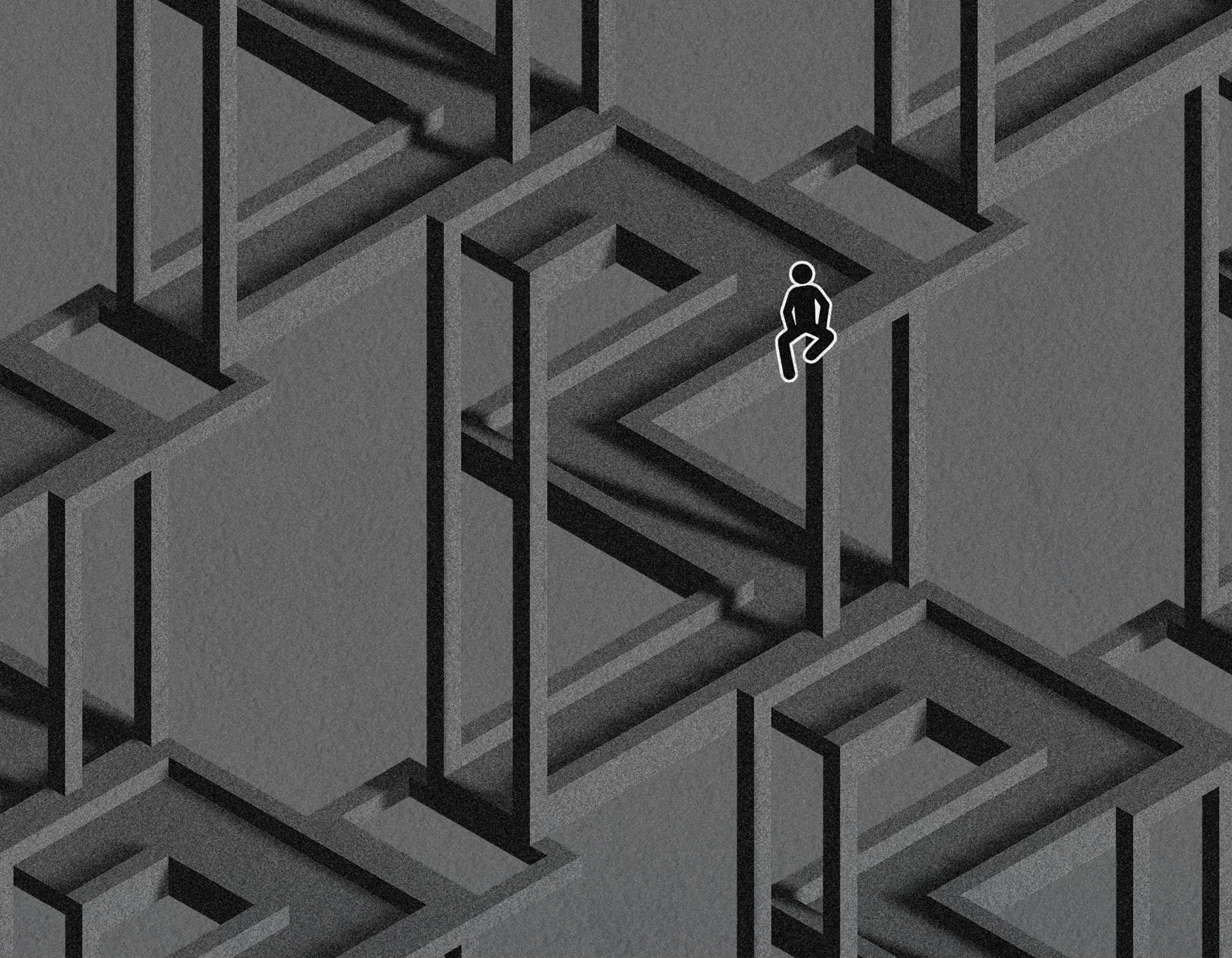
The aesthetic draws from principles central to the grunge genre including photocopier degradation, risograph printing, and analog grain. The heavy film grain and desaturated palette of the later spreads contrast against the teal-and-black typography of the opening and closing pages, as if the message sharpens as the zine progresses. Each spread is designed to follow a loose narrative arc and lead naturally into the next. For example, the splotch of black paint on the right edge of the cover bleeds into the first spread, which features a stick figure escaping toward the blue void that defines the following page.
TECHNIQUES USED
All graphics were designed in Adobe Photoshop and laid out for print in InDesign. The process began with placing text and overlapping shapes on a blank canvas, working within a limited palette of red, yellow, blue, and black, and leveraging blending modes to produce something that feels simultaneously chaotic and calculated. From there, stacked layers of color inversion, saturation adjustments, halftone patterns, blur, and noise were applied to replicate the look of older printing technology and general wear.
A version of the cover without post-processing is included, the same technique stack was applied consistently across every spread to maintain a cohesive visual language throughout.
One additional technique worth noting is 3D modeling, specifically for the Impossible Waterfall optical illusion in the background of the second spread. Working from online references of other optical illusions, I built the model in Blender using an orthographic projection, meaning every element of the scene remains the same size regardless of distance from the camera, which is what produces the illusion of impossible depth. The model was duplicated and connected to itself on multiple sides, then exported and rendered with a light source.
CLOSURE — Reflection
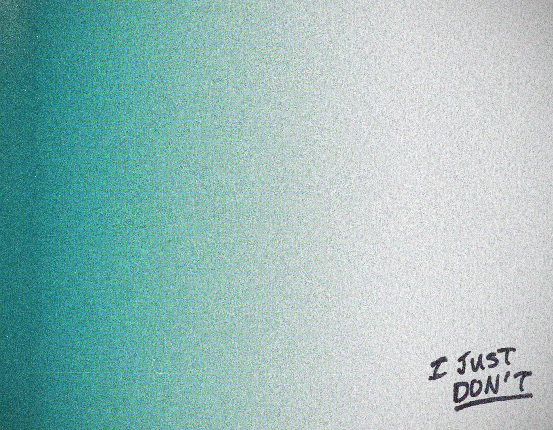
The handwritten closer on the back cover was the last thing added, and it ended up being the most important element. Sometimes the quietest mark carries the most weight.
This was my first time producing a zine, and I think it turned out amazing… not to sound overconfident. The constraints of the format pushed me to add more spreads than I had originally planned, and the technical depth of the grunge layering process forced every decision to be more deliberate than an open brief typically would. In retrospect, this project was always an excuse to experiment with aesthetics I'd been drawn to for a long time, and the trial-and-error involved gave me some solid techniques I've been pulling from ever since!